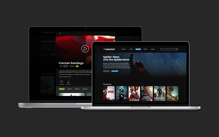
Celestial Streaming Web App
OVERVIEW
Challenge
Streaming has become a part of all of our lives - from the youngest child to elderly citizens who want to watch the news. Furthermore, with the multitude of streaming services available, this app needs to stand out. The challenge for this project is to make it easy for users who share an account to switch between profiles and to make those profiles visually different from each other.
Goal
The goals of this project are:
To create a streaming service that someone as young as 7 years old could navigate with ease.
To make the profiles visually distinct.
To provide a way for parents to be able to monitor what their children watch.
To keep parents’ profiles from being accessed by children.
Role
This is a solo design project for Dribbble Education’s Product Design Bootcamp.
DESIGN PROCESS
The Steps
Research & Empathise
Market Research
For this project, I looked at the desktop, tablet and television experiences of Netflix, Disney+, Hulu and Crunchyroll. As the project went on Netflix became the main source of reference due to the fact that it is the streaming service most used by the potential users I interviewed.
Netflix Pros
Shows regular new releases.
Allows users to curate their own list of shows to watch called ‘My List.’
Makes suggestions based on past activity.
Netflix Cons
Sometimes prices will be increased for seemingly no reason.
User Research
To start the research process I sent out a form to three potential users to see what streaming services they prefered and how often they used them. I looked at how long they had been with their streaming service of choice and why. In a word - flexibility. It boiled down to how much value a person got from their desired service.
“Personalization: the ability to add content to a list. Seeing movie recommendations based on history and preferences.”
-Potential User
Young Child User Persona
Teenager User Persona
Working Parent User Persona
Define the Problem
Pain Points
These are the main pain point that I saw when working on this project:
Some streaming services are hard to use depending on how old or young a person is.
When people are busy they need a service that allows them to quickly watch what they want and then get back to their work.
User Flows
Competitor User Flow: Netflix
Celestial User Flow Sketch
Celestial User Flow
Ideation
Visual Research: Colour
The colours I chose were meant to create the feeling of being out of this world, which is the feeling I want users to have when in this app. They are being taken to a world of fantasy and wonder - where anything is possible. The main colour of purple relates to the colour of galaxies.
Colour Style Guide
Visual Research: Typography
The typeface Poppins is used throughout the entire design. Its simple design and rounded look make the app more inviting but also readable. This part of the design posed an interesting challenge when choosing the font sizes and line spacing that would best suit a web app.
Typography Style Guide
Visual Research: Iconography
The icons used in this project have a rounded design which contributes to the goal of making this app look inviting and accessible.
Iconography Style Guide
Visual Design
Celestial High Fidelity Screens
Prototype & Test
View the Figma prototype here.
Lessons Learned
Testing was a constant process. It started in the wireframe stage where the biggest feature of the app, the profile switching mechanic, was initially tested before doing the full design. The app was also tested part way through the design phase for general feedback. Lastly, the profile switching was tested and reviewed at the end once more.
Annotations
Celestial Documentation
CONCLUSION
Summary
Outcome
The final product is the design of a streaming service that would appeal to people of all ages. It is easy to use which makes it perfect for people with busy schedules. On my path to becoming a product designer, I have done a lot of self-study which meant I picked up a lot of information in disjointed pieces. However, this project gave me experience in designing a web app.
Final Thoughts
Designing the app has been challenging, it took many stages of testing to get it to look polished. However, the product that I came out with benefited from the testing and peer review that this design underwent.


