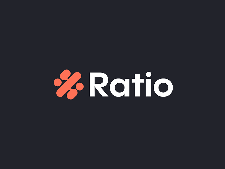
Ratio Branding Design
Ratio Branding Design
Ratio is a data company that helps your business expand by focusing on sales and how you can maximize your revenue by providing you with highly crucial insights while keeping everything simple to use and friendly.
To put it simply, Ratio's strength lies in the fact that it provides users with comprehensive, but straightforward, statistical insights. In the process of developing the Ratio's identity, this was a crucial component. It was important to present them as experts while maintaining a lighthearted tone throughout the branding process.
This symbol was also inspired by the self-exploratory nature of the name Ratio. It's a combination of abstract forms standing in for percentage (%) and graphical representations of data (charts).
The branding reflects the company's values, which include fun, friendliness, simplicity, and technological advancement.
The Ratio's user interface is mostly in dark mode, which was developed after the company's identity design was finalized.
Ratio's visual language is largely made up of forms and elements related to dashboards and datasheets, but with a softer and friendlier aesthetic, and its color scheme is bright and unobtrusive to convey the product's energetic spirit.
Get in touch with me:
contact@secondeight.net — www.secondeight.net — Instagram — Behance


