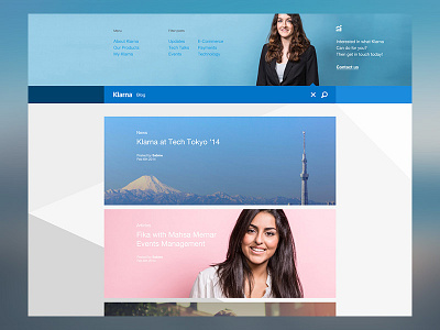
Klarna Blog - top draw menu functionality
A simple menu draw that appears from the top of the viewport. The idea is actually to use this space to encourage sales and other interactions with an elegant/subtle up-sell. For a payments company like Klarna, content spaces like this are always going to be secondary, but it still always valuable territory for creating important customer interactions.
More by Robbie Scott View profile
Like
