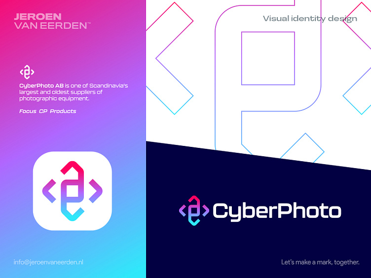
CyberPhoto - Logo Redesign
CyberPhoto AB - Logo Redesign
CyberPhoto AB is one of Scandinavia's largest and oldest photographic equipment suppliers.
I wanted to make the logo more modern and fit the actual word 'Cyber' in a futuristic form and use of colors. Their current logo and identity feel a bit dated and lack the use of a symbol for their brand. Instead of going for a generic aperture element, I wanted to focus more on a monogram and digital reference for 'framing' and 'focus'.
See their current logo for reference here.
Happy to hear your thoughts and possible points of feedback.
Are you interested in working with me?
Feel free to reach out via the Dribbble inbox or direct e-mail:
👉 info@jeroenvaneerden.nl
