Logo design and branding for an audio brand.
Sweet is an audio brand that has been developed by collaboration between Russian and British designers.
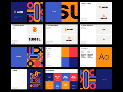
As a way to support the name of the brand, the goal was to make it friendly, colorful, and "sweet." It was also important to make it more humane and fun than most companies in the electronic industry.
The logotype itself represents two switch icons, created by combining them together. This creates the letter S. The pattern is partly inspired by the logotype, partly by lollipops and candies. The abstract graphic combined with vibrant colors gives off a "sweet vibe".
The simple and stable typeface visually complements the brand graphics.
Check out the full case
