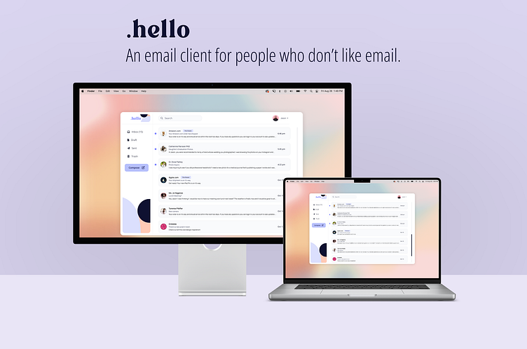
.hello Email App
Communicating shouldn't be complicated.
We all know how overwhelming a cluttered inbox can be. The interfaces of the most commonly used desktop and web clients can overwhelm with an abundance of options, menus, toggles, and views. When you add hundreds of pages of email to that combination, you have a service that most people will avoid using until they absolutely can't anymore - compounding the issue.
Your email app should make communicating easier, not harder.
Problem
The modern online entrepreneur needs an email client that is fast, efficient, and a little less formal. Busy people would rather text than email and the user needs features that automate her emails to help her spend less time on email.
In the past 6 years more and more teams are moving away from email and towards team communications platforms like slack and discord. Many freelancers are also making the move, but it’s hard to constantly invite new people to a slack channel for limited engagement.
Validation
This is a problem for a growing number of millennials and gen x. Reimagining the most widely adopted technology will have better adoption than some new form of technology.
Project Goals
Threaded chat style email view
Canned responses
AI-driven suggestive text (like LinkedIn)
Smart folders and filters
Topical organization
Role: Product Designer
.hello has taken a simpler approach
The .hello email client removes much of the 'noise' and presents you only with the things you need to accomplish your goal.
User Interface and Color Palette
.hello has been designed with light, pastel colors making it airy and inviting. Using whites and grays provides us with a simple foundation for our components. Whitespace, alignment, and balance provide a sense of cohesion.
Key Features
Universal Search
One search bar for everything. Search emails, contacts, labels, filters, images, and documents all from one bar.
Templates
Easy to create and use, templates make responding to messages quick and easy.
Text Messages > Emails
.hello uses a message-like interface to send quick replies. A more formal interface can be accessed with the push of a button. However with the use of the text-message view, and templates, you may find you never go back to the traditional email.
Labels
Easy to customize and search, labels make for a more delightful user experience.
.hello removes the clutter and anxiety from your inbox.
Compact Version
.hello can be collapsed down to the bare necessities to take up less screen space. This makes it ideal for split screens on both Apple and Windows devices.
Mobile
Design System
The .hello app is simple, and so is its design system. Created in Figma, using auto layout!


