BUDDY | The Dog Parenting App
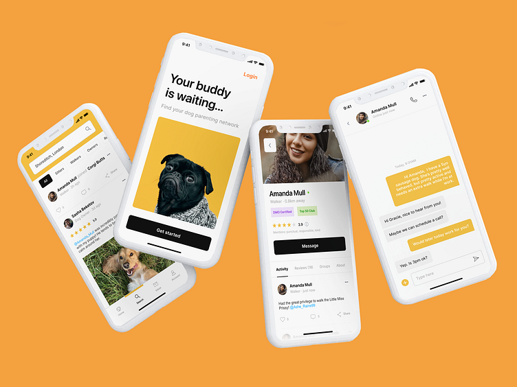
Raising a dog is hard work. Sometimes, it's easy to forget that you're not alone. Need to find advice? Hire walkers? Look for recommendations? BUDDY is the all-in-one solution for dog parenting which connects dog owners, walkers, and pet enthusiasts. This active, review-centred forum ensures that you'll receive trustworthy information and services.

The initial intention of this project was to build a platform from which individuals could find dog walkers with ease. To understand the wants and pains surrounding hiring a dog walker, a series of interviews were conducted with friends and family who had experience owning a dog. With this information, it became apparent that the user persona struggled with trusting walkers the most. Money was of relatively concern.
Pet owners want to ensure that their dogs receive the best care possible, and that walkers are reliable and responsible. As a result, ‘professional’ walkers were rarely hired. It is much more common to ask family and friends for favours. So how could we provide a reliable and personable experience for dog owners who do not have the privilege of this network?
To encourage social trust, BUDDY was made as a forum-based virtual community. This means the quality of the walkers are review based. Posts, a resource for any dog care related content, are open to free range comments and communication. You can message and pay walkers directly through the safety of the app. The most important aspect of the app was to reveal the genuine level of skill and passion that users had in their pets, so that owners could entrust their dogs with reliable people. That’s why the app feels much warmer than your usual dog walking app - it is centred around interpersonal relationships, not the services that are a natural byproduct of those ties.
From this concept, the architecture of the app, user flow, and wireframes were mapped and tested.
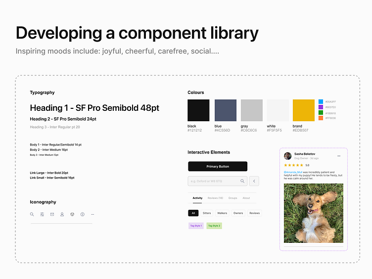
The goal was to develop a library of UI components that reflect the general good humour, love, and mood that dog lovers have for their canines. Yellow has been proven to be associated with cheer and warmth to most, and became the brand colour. It also primes users to interact with others with a positive spirit. For accessibility, the primary button couldn’t be yellow as well, due to low text legibility. Rectangular buttons and a minimal interface were chosen to suggest reliability, as opposed to a bubbly, gregarious appearance. On and on, these various considerations were made to ensure the app’s visuals reinforced the design intentions.
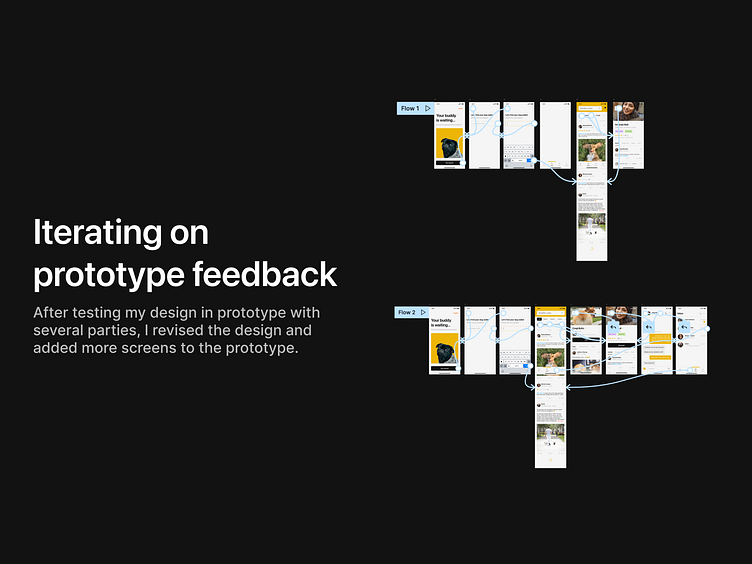
The testing process was open to functional fixes and feature-based feedback. It was necessary to refine the original idea, and give potential users a clearer understanding of the proposition. There were far more screens that testers wanted to see that transcended the scope of a case study, but there were a variety of suggestions based on the existing ones. Some included introducing short form content, a ‘streaks’ feature, and expanding the scope of the content entirely to involve veterinary professionals. It was great to see testers excited about the app and its potential growth direction. Initial iterations were conducted to fix basic functionality errors, but could extend to a far more complex design project in the future.

This case study was conducted over the process of Dribbble’s 12-week Product Design Course. Thank you to my mentor Juan Carlos Díez Rodríguez and classmates for creating such a warm and encouraging learning environment!
