What if ______ Tumblr but crypto?
What if Tumblr was built in the web3 age? How would that work? What would that look like?
// Unfiltered thoughts and visual ideas below
For starters, I think it would be much, much simpler.
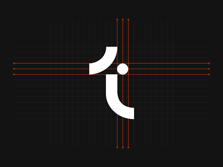
Starting right from the old-time classic logo.
Of course, still a T shape, but a simpler one.
Feed?
No ads, no Post+, and no “have you seen this lately?“ banners.
Just a chronologically ordered timeline of the latest posts.
Yes.
Simpler, but no less tactile and fun to use.
For example, the search input might look like a paper receipt.
And if you use it, it’d go like this.
Gravity does not exist in the digital space.
But what if it did?
What if the notification label gets dragged to Earth when there are too many unreads?
Don’t want this to happen? Just check them out.
Let’s talk about the actual Tumblr posts.
What if a post on the Feed looked like this?
Author’s name, author’s wallet, and a bunch of basic actions like Delete, Edit, and a few more.
Yes, that’s just regular stuff—but here’s the catch.
What if each post could be optionally minted as an NFT? Likes, replies, and reposts are all fun and good, but web3 people need more —they want to own things.
What if there was a way to give them what they want? What if anyone who follows you and likes your content could mint the posts they like the most and collect them. You’d have control over what tokens are minted and don't have to worry about gas fees.
Unlike crypto-only media platforms (ie. Showtime, Opensea, etc) in web3 Tumblr, the world of NFTs would natively mingle with non-NFTs content.
What kind of content are we talking about?
You could share just about anything; that memo you wrote to yourself years ago, the photo of your first car, the track you never published on SoundCloud, or the camcorder videos that still live somewhere in your old computer. Texts, photos, audio, videos—anything.
These “create” actions should stay visible and persistent on the bottom bar. I guess it is just more convenient…
… but if you don’t feel like creating—you could always collapse them and get a richer Feed experience.
Drafts? Yes, they’re also always there, at hand, on the bottom bar.
What if drafts would look like actual unfinished pages from a physical notebook?
Cool, but careful—some of the oldest ones might actually age pretty badly.
Want to delete one?
Np! We’ll make it disappear for you.
Let’s take a peak at blog home pages.
I’ll just say it. No to overly complex dialogs, and no to a bunch of meaningless, distracting, buttons. Also, no “check that other 17829 blogs” type of widgets.
Just one contextual page that grows over your feed.
Browse it if you want it.
Search it if you need it.
Follow if you like it.
Simple things.
And what if you actually want to explore similar blogs? Shuffle suggestions by throwing the dice in the middle—they will appear immediately on the right of your screen.
Newly suggested blogs are up next on the right, and the ones you just browsed immediately on the left.
Like I said, simple things.
For desi@n like this and more, follow us
On the ether web openprest.com
On the bird app
On the polaroid app


