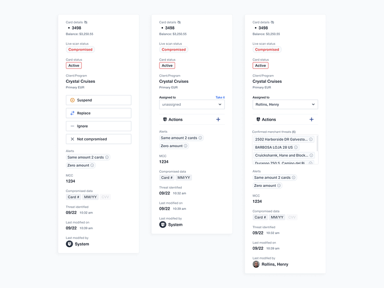
Side panel for bottom sheet
One element and its 'evolution' across few sprints. Things started pretty light(left), and then got a bit out of control. Ideally you don't want to overwhelm the users by showing them too much stuff at once, but sometimes you gotta do it due to the nature of the industry(and the product itself).*
-------------
Feedback, especially negative, always welcome!
More by Peter Grochowski View profile
Like
