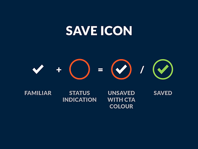
My take on the save Icon
The save icon got outdated with new generation users that have never heard of a floppy disk, but getting a new icon standard for it is pretty hard.
In my current project i have taken the approach of working with the familiar check icon, combining it with a ring to indicate the status and act as a button trigger.
By using the call to action colour on the ring i can focus the users attention to it as the main goal on the page.
If the current settings are not change or when you click save, then the saved status will be active. Combined with the colour green to show all is good.
More by Robin Klein Schiphorst View profile
Like
