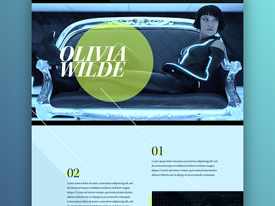
Magazine to Web #1
One of my 2015 goals is to experiment more with layout. I'm sure many of you feel that too many sites feel same-ish. I'm dying to freshen things up.
So, as an exercise, I'm drawing inspiration from magazine layouts and this is the first of a series. The actual design/subject matter is throw away, which gives me freedom to experiment without constraints—particularly with layout, typefaces, color combos, etc. One of the goals is to retain the functionality and familiarity of a website while introducing some fresh new ideas.
I feel like magazine layout (or print in general) has pushed a lot more boundaries than web, despite the the tighter limitations. If you’re curious, I have a Pinterest board of magazine layout inspiration here. Feel free to recommend any layouts you really like. :)

