Smart Watch UI
Hey guys! 👋
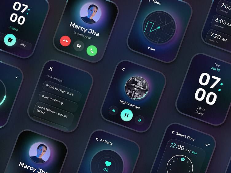
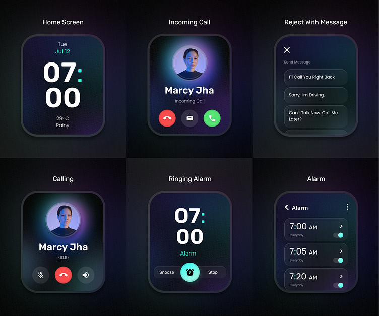
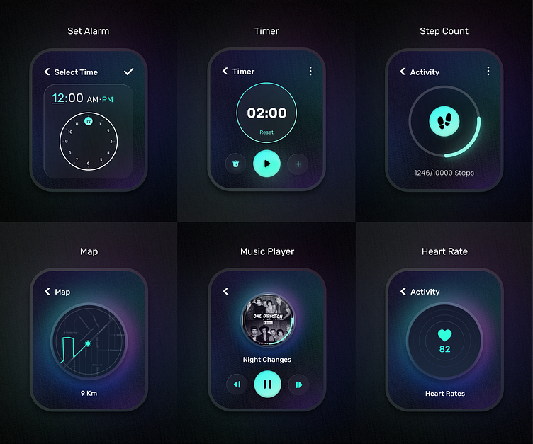
Here, we present our most recent Smart Watch UI design concept.
Smartwatches UI Design is still completely new and unfamiliar territory for many designers. The size of a device and The way people interact with them both require different design approaches.
Our everyday lives are growing more, and more dependent on wearable technology, which gives us access to calling features, fitness notifications, and much more.
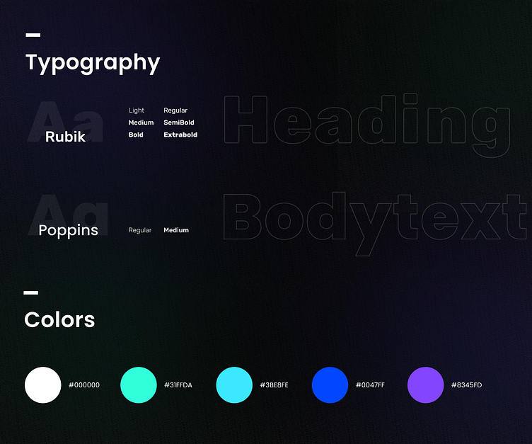
Typography must honour the content. It is essential to make text readable, understandable, and legible. That is why we used Rubik & Poppins font.
Here, we utilised the dark theme and a combination of three colours to make it pop and stand out since colour is a potent instrument that may help communicate with consumers.
Feel free to share your thoughts in the comments 💬.
Press "L" if you like ❤️ it.
Design Created by Nishtha Chapadiya
Checkout our New Website Design
