PawPals: The Dog Walking App
This project was created to meet the needs of dog owners who need a convenient service to find a walking Pal for their furry friends.
Tools used: Figma, Adobe Illustrator, Adobe Photoshop.
The Final Design
Inspired by a Mondrian color scheme, I endeavored to create a cheery, playful interface that prioritized two things: trust and convenience. Verified users are marked by a verification mark on their profile picture. Walker profiles show the most pertinent information at a glance. I included an option to skip the Log In/Sign Up option so that users could test the waters of the app without committing entirely to creating a profile.

Below is a video that highlights some app features and walks you through the basic flow of the app. You may also check out the prototype using this Figma link.
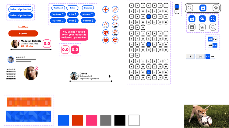
The Design System
My favorite part about this project was creating the design system. Nesting components and coordinating animations was extremely rewarding. It felt like solving the puzzle of balancing visually appealing components with functionality. The final iterations came from tweaking the originals to meet accessibility standards.
The Problem
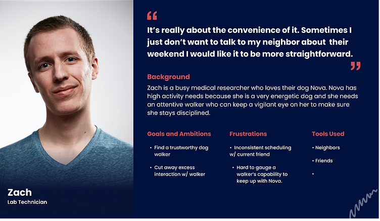
My first goal was to identify the problems that a dog walking app would need to address for dog owners. After some interviews with dog-owning friends, I discovered that two major pain points that these users have. First, users want to be able to trust someone with access to their loved pets and their homes. Second, users are looking for a convenient alternative to the tedium of small talk and social interactions with the people they currently rely on for dog walking. I created a user persona, shown below, that summarized these concerns so I could use it to guide my design decisions.
Scouting the enemy
Building a good app required some research into the market alternatives that already exist. I needed to identify their strengths and weaknesses. This would help me understand what drives their success and what areas I feel I can improve upon.

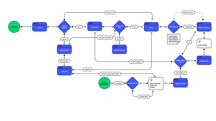
User Flow
Using my market research and user persona, I created a user flow to act as a skeleton for the app. My goal was to create the most direct path possible from start to finish. I also included some options for users to simply browse and an open door for adding services to this app as needed.
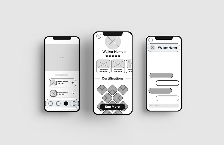
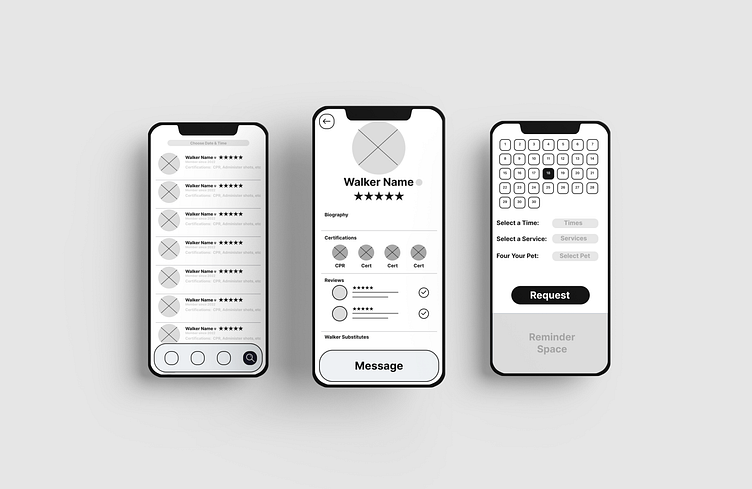
Wireframes
With a skeleton in place, I started to piece specific ideas into conceptual, low fidelity wireframes. I experimented with multiple layouts to see which ones created the most positive response from potential users.
Visual Identity
These users have a lot of fun with their dogs, so I wanted to create a design scheme that echoed that playfulness. A Mondrian color scheme fit the bill perfectly. Design is a process, so later iterations of the high-fidelity wireframes had more intention behind color choices and adhered more closely to accessibility standards.


A moment of thanks...
My many thanks to Jesse Showalter, the Dribbble team, and especially my mentor Chris. They all helped me immeasurably to understand these concepts and grow as a designer throughout this process. I could not have done it without them.
