Zoomies: Building pet care trust with thoughtful data + design
Hi 👋🏽 my name is Ankur.
I’m a consultant turned PM turned entrepreneur. As part of my latest entrepreneurial venture, I needed to refine my product design chops, so I signed up for Dribbble’s Product Design course.
Below is my first case study through the program.
Thanks for reading!
Overview
There are over 400,000 Pet Care Providers in the US alone. If you live in a major city, this means thousands of walkers to sift through to find the right person to take care of your pet.
The Problem
For first-time users, it takes a long time to find the right walker.
Finding the right walker, especially for a first-time user, is critical for the entire dog walking ecosystem.
For a pet owner, it can mean access great support system or a bad experience.
For the business, it can mean a significant increase in first-time conversions and increased rebookings or churn, and lost revenue.
For a dog walker, it will directly impact earnings, potentially causing them to churn as well.
Phase 1: The Research
To figure out how to design a better app experience, I decided to explore the following avenues:
1. Research the popular dog walking app web presence (brand, messaging, market data)
2. Analyze the app experience for two major dog walking apps, and identify areas that could result in a 10x improvement.
3. Speak to customers who currently use dog walking apps to gain qualitative feedback
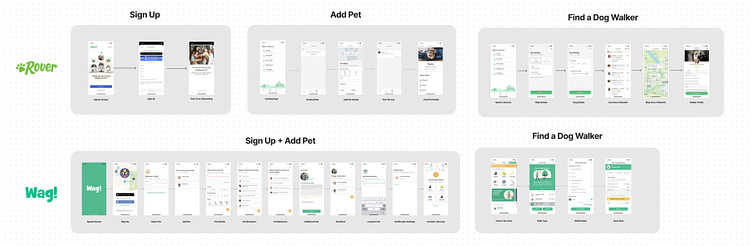
I decided to focus my study on two of the most popular dog walking apps, Rover and Wag.
Market Research
From this exercise, several themes emerged:
1. Trust 2. Availability 3. Convenience
Theme: Trust
Observational summary:
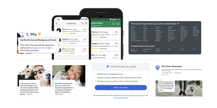
Both apps heavily used the word ‘trust’ almost everywhere.
There are additional services that emphasized trust:
Verified Background Checks
Insurance Programs
Reviews
Key takeaways:
Seeing what is already existing helped establish a baseline. How might we establish trust from the start of a user's journey?
Do we have to earn a new user's trust over time? What parts of our app experience can we design with that in mind?
Theme: Availability
Observational summary:
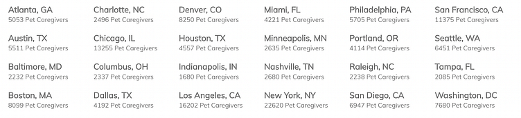
Rover emphasized this by showcasing its network of walkers
Both Rover and Wag showcased the number of cities they are located in
Key takeaways:
While the number of walkers helps, knowing how many walkers are a perfect match for me could take this a step further
There are 16,202 pet caregivers in LA alone(!). How could we simplify the finding process for users?
Theme: Convenience
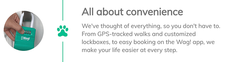
Observational summary:
Both apps highlight how easy they are to use
Wag emphasized the ease of user while in service
Key takeaways:
Ease of use feels like it should be table stakes in today's age, so perhaps we could get more specific on ease of use. For example, what makes it easy to find the first-time walker?
Other interesting research finds:
Rover emphasizes boarding as this brings 54% of their GBV (Gross Booking Volume)
Rover did $400M in booking revenue alone in 2019. That gives us a scope of the scale of the industry.
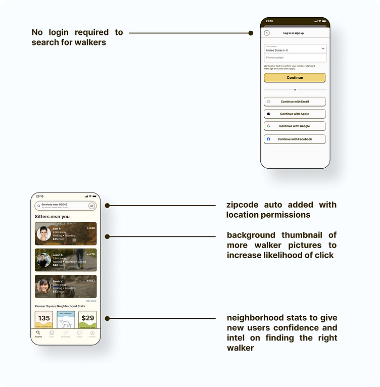
Studying the onboarding app experience for first-time users
Key Takeaways
Understanding Pet Owner Vs. Business Goals During Onboarding
For the Pet Owner:
Does this app have walkers in my area?
Do these walkers fit my budget?
Are these walkers available during the time that I need them?
Can I trust this walker?
Will my dog trust this walker?
For the Business:
Reduce the time to the first booking
Increase the signup conversion rate
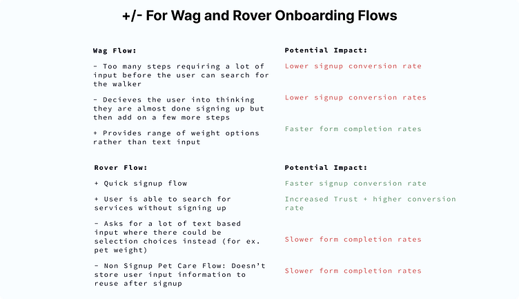
Exploring the relationship between the amount of trust earned and the amount of user input needed
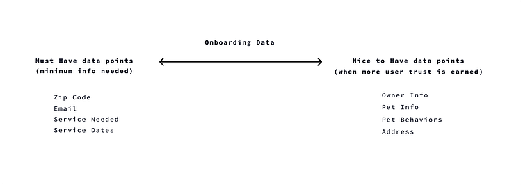
Can we design a flow that immediately allows users to search for walkers without needing to input many data points?
What kind of data is needed versus nice to have?
How can we store information to surface up later to avoid redundant entry?
Some personal thoughts around user trust
Trust has to be earned from our users from the very beginning. Asking them to input a million things without giving them something of value lowers that ability to earn trust. As we earn trust with them, we can collect more information that would be helpful to provide a better experience.
When you increase the number of inputs asked from a user without providing value back, you’re also increasing the expectations that the user will have of what your app will provide as a result of those inputs. These should be balanced to ensure we don’t lose the user entirely by setting expectations too high and underdelivering.
Customer Research
For this project, I interviewed two users using Rover and Wag most frequently.
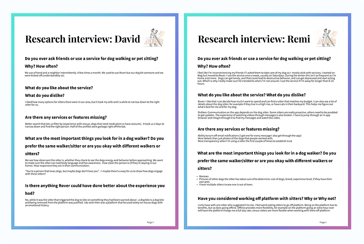
What stood out from my customer conversations:
1. Both customers mentioned that they spent a few days researching the relevant pet care providers before making a decision
2. Both customers mentioned the desire to narrow down to the right pet care provider by using better filtering that honed in on specific pet care experiences (for example, rescues).
3. The amount of communication from different pet care providers is highly variable, some more communicative than others. Was there a way to establish a standard baseline level of communications across all pet care providers?
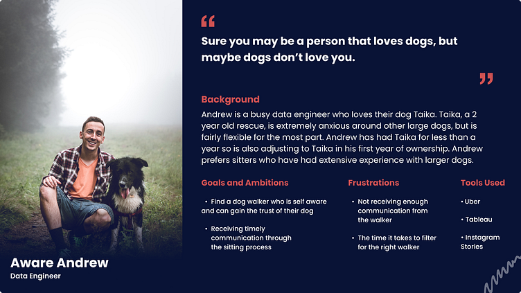
Creating a Persona
Based on the research above, I came up with the following persona:
Phase 2: Designing User Flows
After evaluating where the existing user onboarding flows fall short, I decided to narrow down the scope of my user flows to achieve the following:
Key Takeaways:
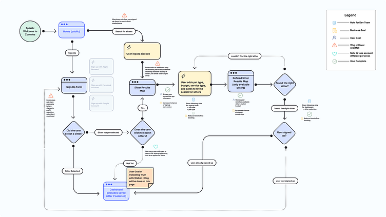
Through my user flow diagram, I incorporated the goals of the user and the business as part of the flow. This is to keep the core objectives in mind as we design and build the application. With multiple stakeholders in the mix (designers, engineers, pms), incorporating this will be helpful to get alignment
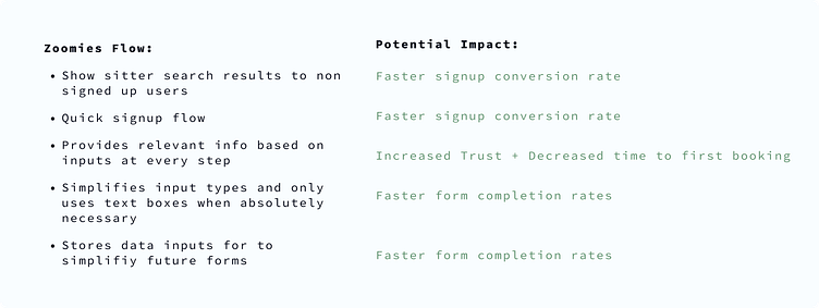
I found several opportunities where data could be resurfaced to avoid redundant user input
Phase 3: Creating Wireframes
I blended the user flows with my wireframes so we could start visualizing where we could start refining the user onboarding experience.
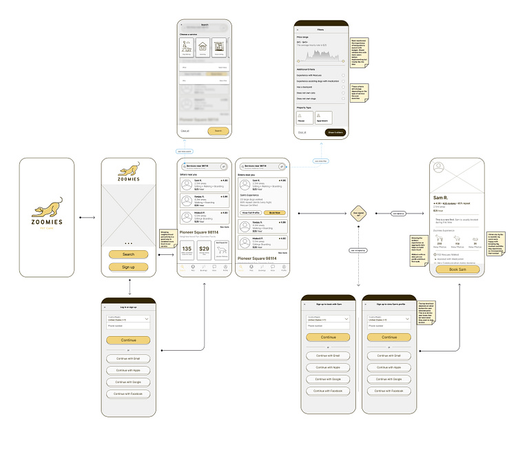
Through wireframing, I realized there were a few ways we could add trust for new users:
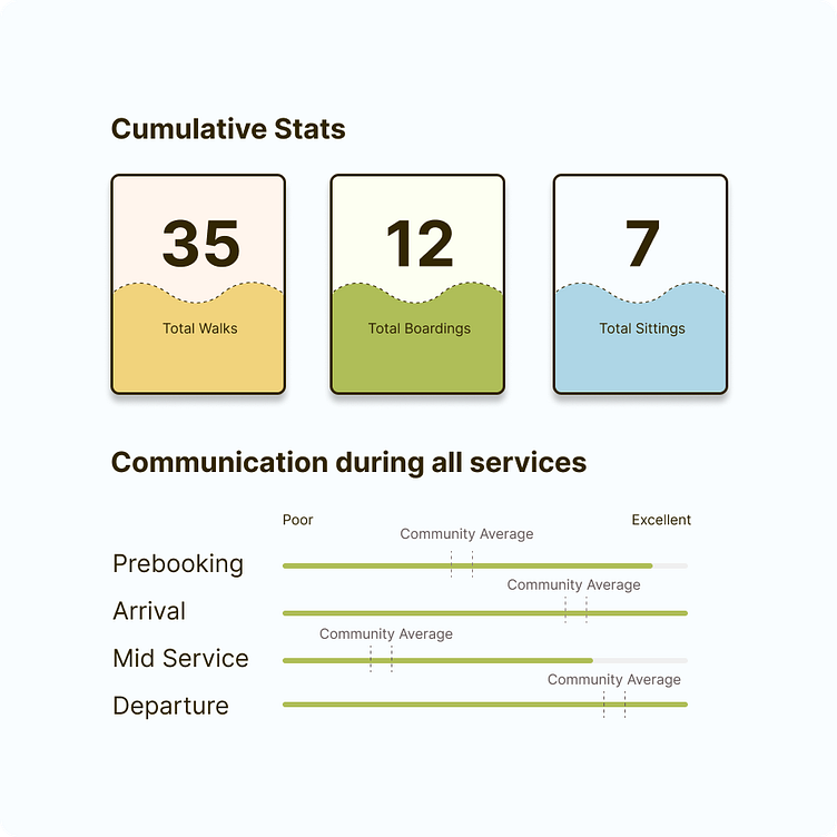
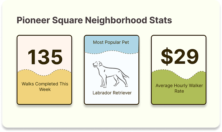
Showing neighborhood activity data to help them make better choices (average walker rate, for example)
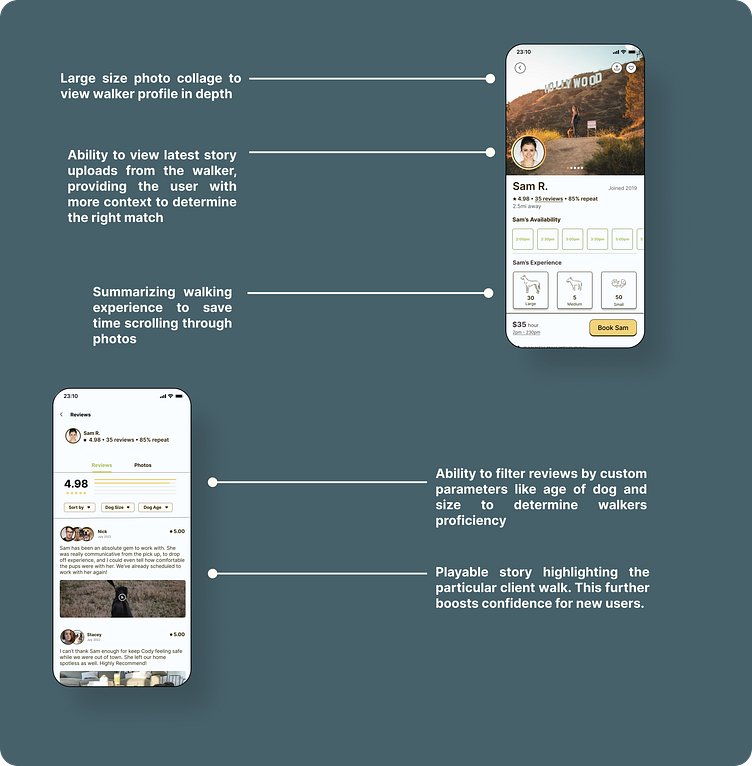
Taking highly visually tasking actions like scanning photos and looking for their size and simplifying the time to receive that information by creating aggregate counts
Provide walker data based on in-app activity versus solely relying on user reviews.
Phase 4: Visual Design
Brand
We can probably write an entire volume of books on brand alone. For the sake of this case study, I stuck to high-level decisions that answered the following questions:
Who are we?
Why do we do what we do?
How do we visually create a look and feel to invoke our identity?
Meet Zoomies.
We provide down to earth pet care
Mood Board
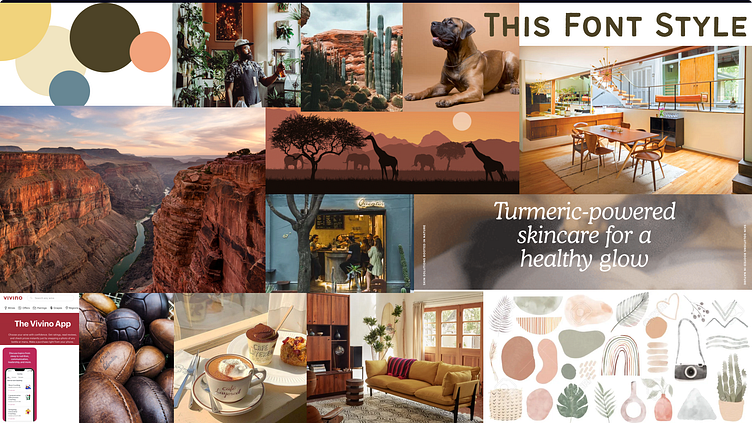
To which my class said:
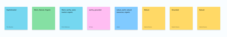
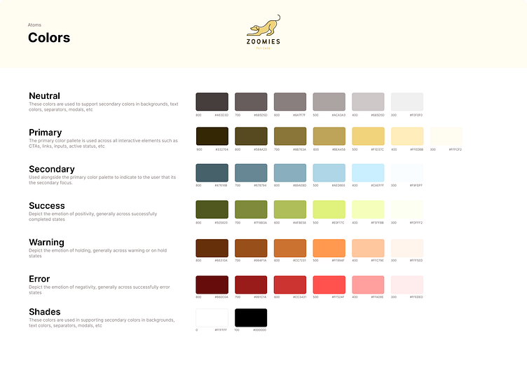
It seems like I was on the right track but I also wanted to invoke a more playful color into the name, so I tweaked my color palettes to feel like this:
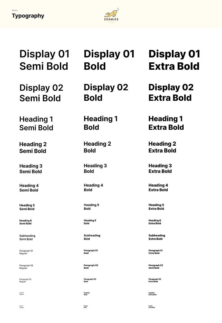
Typography
My requirements for the typography were the following:
1. Should reflect the down-to-earth brand
2. Easy on the eyes, whether in headings or large paragraphs
3. One that had a variety of options in type formats
Heres what I came up with:
Creating High-Fidelity Designs
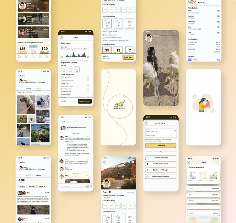
Prototyping
I sat down with both my earlier research customers to understand how they would go about finding the right walker on Zoomies.
Here were my key insights:
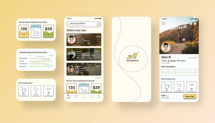
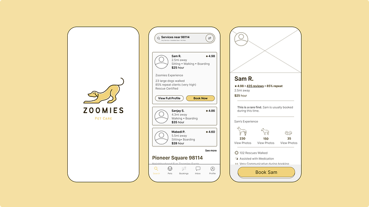
1. Walker Stats Data was far too hidden inside of the app
The data that would be used to build trust was hidden 3 levels into a walker's profile, making it difficult to find.
I had this embedded inside of reviews initially and found that both my testers could not find it. However, upon prompting its location, they asked for this to be visible at the top level profile. I also learned that the second stat was helpful for them to learn how the walker relatively performed in communication across the span of the trip. This was something that put them at ease.
2. Counts versus booleans
The data that would be used to build trust was hidden 3 levels into a walker's profile, making it difficult to find.
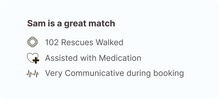
I learned through the prototyping that the count of rescue dogs walked wasn’t much more a helpful factor than “Rescues Walked” as a true or false statement. So I decided to scrap the number here.
3. Numbers swayed the trust factor heavily
In each of my user interviews, I changed up the number of reviews each walker had. In my first interview, the walker had hundreds of reviews, and the user was more relaxed and confident. Once I switched up the profile to a lower number of reviews and less walking experience, the user began to look deeper at the data we provided to determine if the walker was the right fit.
4. Neighborhood stats were a hit!
The neighborhood stats quickly helped both users identify what to expect regarding pricing and activity in the area. This gave them goal posts in which to review their walkers, which would reduce their time to find the right care provider.
I took the findings above and refined my user interface designs accordingly.
The Final Product
App Experience Overview: How we’re using trust to speed up the time to find the right walker

Lessons I took away from this case study
Numbers for mockups matter, the total # of reviews makes a huge difference in how people will navigate decisions. In the future, I will prototype with both low and high numbers to see how that sways users’ decision flows within the application
To be extra careful with the size of the surface area for buttons, users can click on the buttons without any issues.
Prototyping before wireframing. While we ran through this case study in the order that was shown in the class, in reality it would have been a lot less overhead had I conducted the prototyping of the experience with the users prior to the final visual design. I will keep this in mind for future builds.
What I would want to focus on if we had more time on the case study:
Error States - figuring out how to surface errors that show up inside the application
Empty States - seeing how users react when there are little to no reviews on the app
In Service Flow - designing the user experience while their pet is getting care
A Pet Care Provider Interface - engaging in a design study to understand how each of the design decisions on the Zoomies side affect the pet care provider and tweaking my designs accordingly.
These states while important were not critical to my focus for the case study.