Chicago Coffeehouse

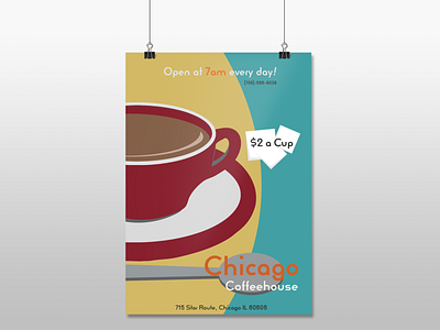
The idea was throwback 40s/50s with a contemporary spin. Adobe Illustrator helped me achieve this look and the smart font choice pushed the retrogression with little help from the designer, which is what a great font can do. The trichromatic hue choices also speak to that specific time. The gut punch of orange lends to the feeling of excitement.