Intensity Nutrition Supplements - Package Design
History: Founded by a former Navy SEAL and a group of hardcore functional fitness enthusiasts, Intensity Nutrition develops nutritional products for athletes who train and operate at the highest thresholds of athletic performance. Special operators and those who train at ultra-high intensity require unique nutritional support – and SEALs are famous for the intensity of their workouts.
Design Inspiration
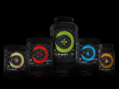
The existing Intensity Nutrition package design primarily used the logo for design elements. Each supplement type was distinguished by typography, which isn’t a bad quality, but the brand left more to be desired to really stand out on the shelf amongst the competition. In the discovery phase of the sports nutrition and supplement industry, other brands use bold, loud colors, some are “rock & roll” feeling with grunge textures and type (often poor font choices), others excessively use a reflective foil material or a solid powerful color with modern, edgy, or techie type. Most supplement labels were overcrowded and too noisy.
The most effective brands I took away from research used bold color and had strong whitespace and typography. My goal with these labels was to keep the design controlled, pulled back from the noise of competing brands, use bright color, geometric shapes, and icons to differentiate each supplement type. I stuck with using only a couple of different fonts (Proxima Nova and Eurostile) to maintain a modern, simplistic, geometric design that retains masculinity, yet also appeals to a female audience. These labels are actually printed on a holographic foil material which highlights the logo, thin lines in the geometric circle graphic, and are subtly randomized throughout the triangle pattern, giving interest to the background.