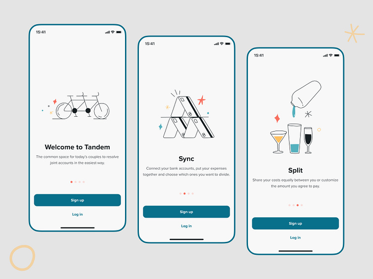
Tandem Mobile App — Onboarding Screens
After eight months of intense collaborative work with Tandem's founders, we're happy and sooo proud to see the app live on the Apple Store 🎉
"Tandem is the easiest way for couples to share expenses," they say. Today we share with you the fancy screens we crafted to enlighten users the first time they open the product. The beautiful illustrations Fran Pulido composed and the straightforward messaging make a great combo to create a comprehensive guide to seducing all new users 😉
We'll show you more about Tandem design and frontend development soon; stay tuned! 🤓
Do you have an idea? Tell us about it, and we'll make it a reality together: hola@z1.digital
You can also find us here:
More by Z1 View profile
Like
