Leashed Case Study 🐶
To learn about all aspects of the product design process for my Dribbble Product Design 12-week course, I developed a dog walking app.
The following information, images, and outcomes detail the process. The app was completed over the course of 7 weeks (roughly 2-5 hours per week). Portions of the project such as market and user research were collaborative, but a majority of the work was completed individually.
Research
To solve the problem, I began by conducting market research. My focus was primarily on Rover and Wag! However, I also viewed a local business option for additional perspectives.
Challenges:
Rover and Wag have a long onboarding process and are not able to view the dog walker prior to committing to creating an account.
Opportunities:
With the local option, walkers are hired and can be viewed easily. Able to get a better idea of who is taking care of the pet.
I also conducted interviews to get an idea of what people valued when considering a dog walking app.
Interviews were conducted in person and through surveys with a total of 5 participants.
Results:
All participants were interested in the app and loved the idea of:
1) having more freedom and;
2) providing something exciting for their dog
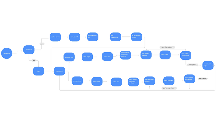
User Flow
Goals
Simple user experience
Optional add-on services and personalization to accommodate a variety of user groups
Primary focus on dog walking
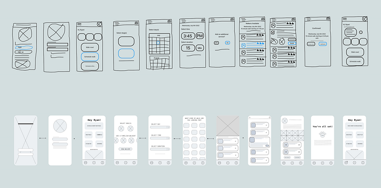
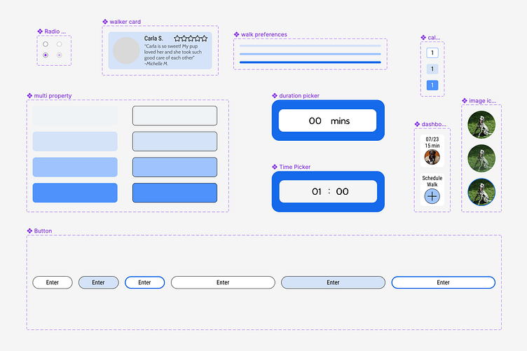
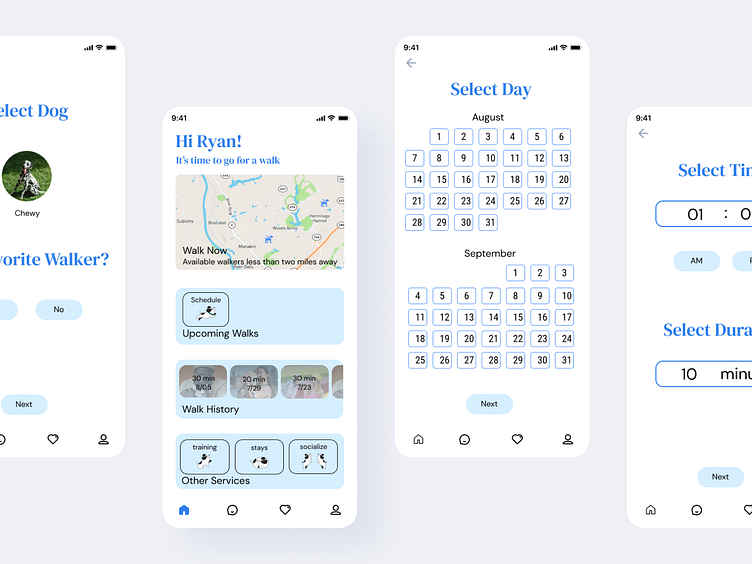
Wireframes
In the research, I found that trust was a barrier to entry. It was also noted that additional services would be appreciated.
Some of the solutions I created were:
Add an option to use a familiar/previous walker
Show a map of walkers in the area on the homepage to build a community feel
Include preferences for the dog and dog walker to feel confident in the choice of walker
"Is this person the right fit for my dog?"
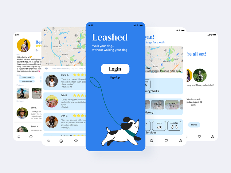
Visual Designs
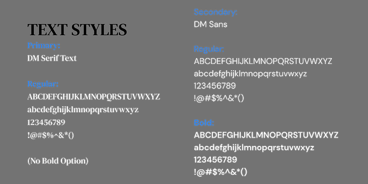
Visually I noticed that Wag! and Rover both use green as their main colors. When designing the app, I wanted to make sure that the visuals felt friendly, outdoorsy, but different from competitors.
I ended up choosing a color palette of greens, blues, and creams. I also wanted to include profile pictures to make the app feel personal and remind users of green grass and blue skies.
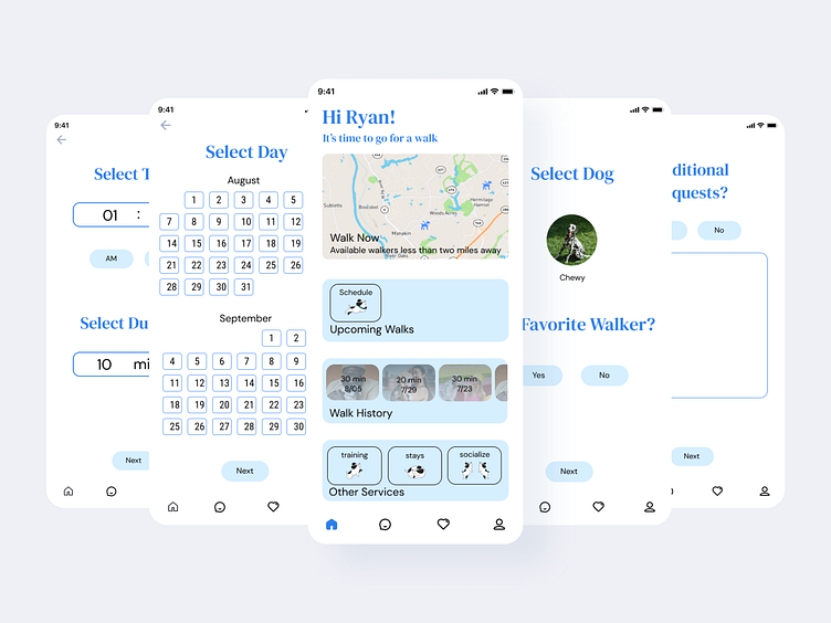
2nd Iteration
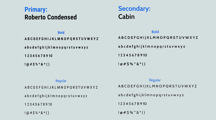
I used different fonts to create a more active feel and added more blue elements and brighter images.
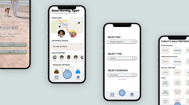
2nd Iteration
To create a more active feel, I used different fonts, and added more blue elements and brighter images.
Testing the Prototype
The big change I made was eliminating the preference section. From the user testing, it was a bit overwhelming and felt like an unnecessary step. In the future, I'd like to make this an option, not a requirement.
The users were asked if they would be interested in a dog walking app after using trying this prototype. All users agreed that they would be more interested.
And that's it! Or is it....????
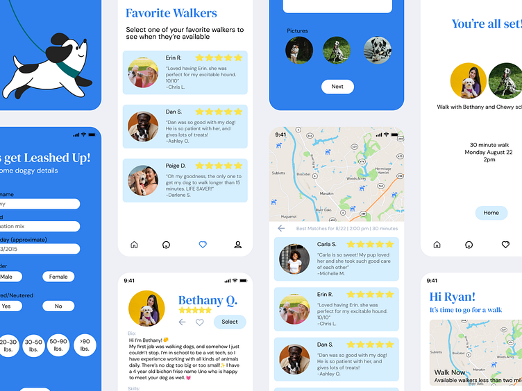
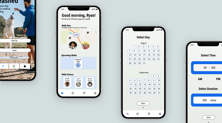
Visual Designs: 3rd time's the charm!
After finishing this project, I decided to make some visual updates. Even with the changes, it didn't feel clean and crisp, and I felt I could do better.
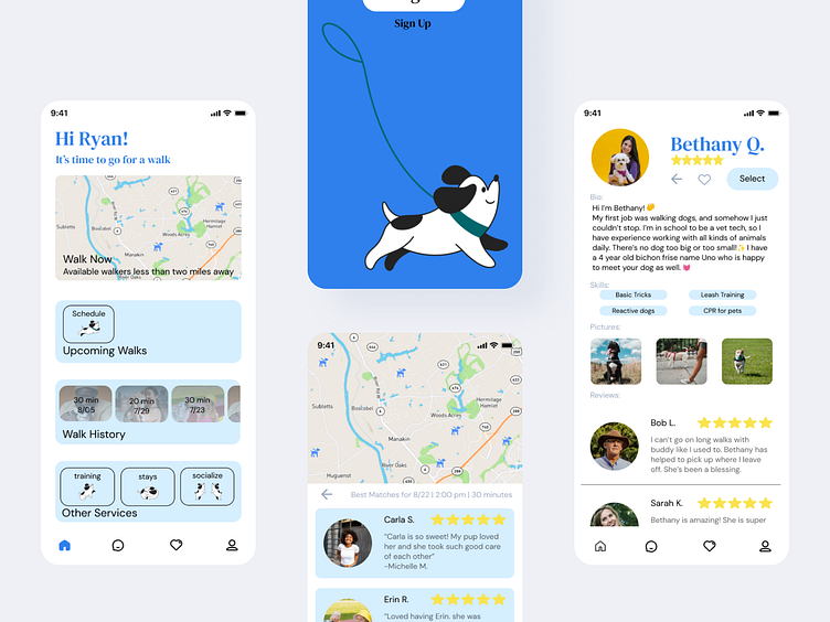
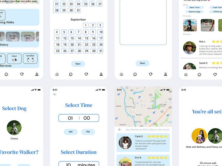
This iteration quickly became my favorite. So much so that I built out waayyyy more screens, including a 'favorite walker' page and pathway, a sign-up pathway, and an additional walker profile.
Outcome/Results
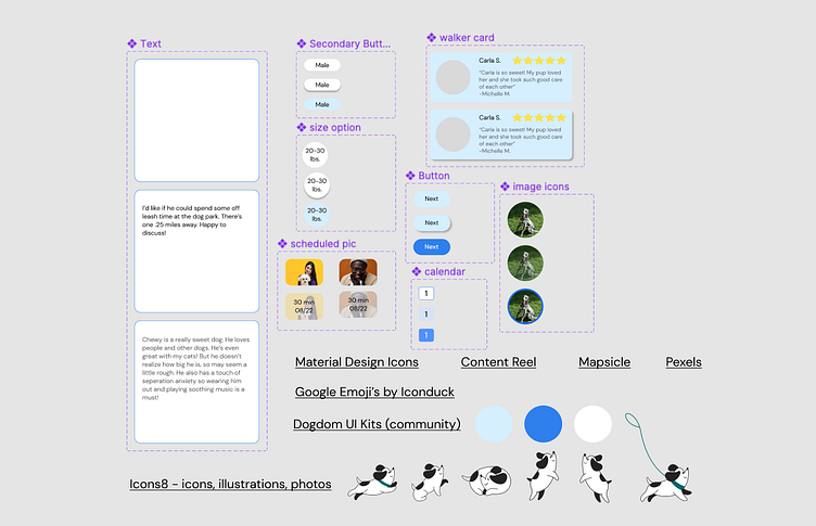
This project taught me A LOT about Figma. Prior to this project, I didn't know about components, templates, or auto layouts. Now, I have a grasp on the entire product design process!
Most specifically, I found the research and user testing to be especially helpful in confirming or questioning if I had found a solution.
Three design iterations may be a lot, but I'm so happy I ended up with the third version. Each design was better and better! It just gives me such promise that the more I practice, the better I will become. :)
Looking forward to continuing!!
