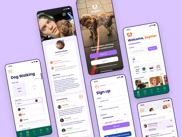
Wiggle Dog Walking App
I'm excited to share my experiment, setting up and designing a dog walking app that connects dog owners with dog walkers. I had the challenge of researching, ideating, designing and testing this new to market product.
The Problem
In a large dog-owning country like South Africa and post Covid, the demand for pet services has grown exponentially, with people returning to work. Solution: An ‘Uber’ of dog walking services. A mobile App that helps dog owners with busy schedules find trusted dog walkers.
User Research
Following market analysis, I learnt that nearly two third of South Africans are pet owners under the age of 40 (millennials), who work more than 35h per week.
My qualitative Typeform interviews indicate, most of dog owners rely on their friends and family to look after their pets but are in need of a sustainable pet caring alternative. I’ve included 2 personas that summarise the underlying concerns of the users in my research:
Findings
Dog owners are apprehensive about allowing a stranger to care for their dog. Trust was a significant issue, but users also wanted good communication, a walker in close proximity and peace of mind knowing their walker has been properly vetted.
Users like Sophie expressed they would make use of a professional service granted her concerns were addressed.
With trust, credibility and communication features in place, Wiggle aims to assure users that their best friend is in good hands.
Userflows
With a better understanding of who the users are and their requirements I started mapping out the user flows with simple onboarding, booking and messaging flows.
Wireframes
Following the research and flow iterations, I started to wireframe all the functionalities from my learnings.
Once the wireframes were refined, I went on the design the visuals. The colours, pictures and icons are friendly and bold to appeal to the large millennial dog owning market.
The final visual screens were designed using the system above for speed, future changes, scalability and consistency.
Prototype + Test
To test the design I sent out a prototype testing the signup, booking and communication process. 100% of the users completed the tasks but recommended some changes:
Final Prototype with changes from users
Outcome / Results
Turning a problem into a business opportunities was a rewarding process. During this end-to-end process, I learnt to really lean into users’ concerns / feedback and design around them. Lastly, though time consuming, to refine and innovate as much as possible as this will only add to the success of the user’s experience. I look forward to being involved in many more product designs.
Special thanks:
Project Mentor @tayayamenko
Images @marolizes


