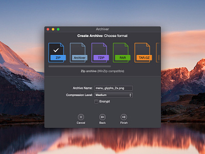
Archiver App - UI Improvements
I love Archiver app by Incredible Bee, and use it every day. But I've been feeling like the UI doesn't quite fit in with the OS X Yosemite aesthetic. So I cleaned up the blurry icons, got rid of the default gray top bar, redesigned the archive types to be more simple and some other tweaks.
Make sure you check out the attachment for the other screens.
More by Matthew Skiles View profile
Like

