Ample Design System | Messages Panel
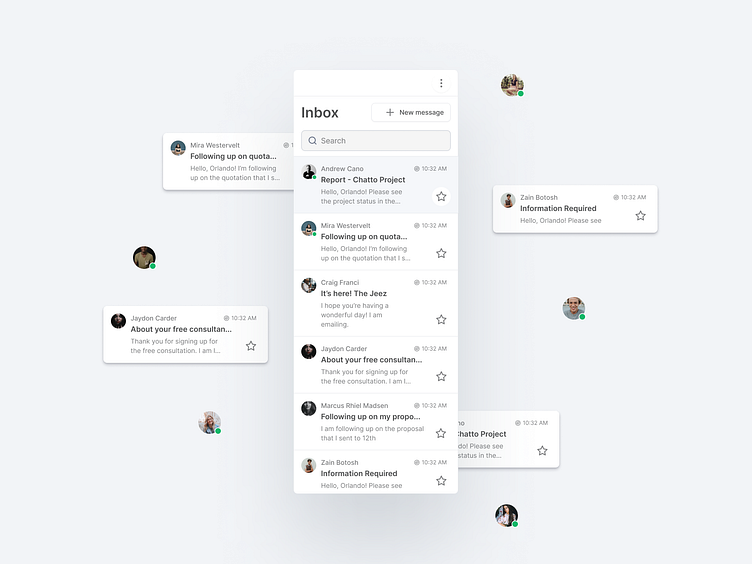
This widget is based on a few UI components, such as text field, Button, Labels and avatars.
Component Usage
1. Button - Buttons communicate actions that users can take. They are typically placed throughout your UI, in places like Dialogs, Modal windows, Forms, Cards, and Toolbars .
2. Text fields - Text fields allow users to enter text into a UI. They typically appear in forms and dialogs. Text field component design should provide a clear affordance for interaction, making the fields discoverable in layouts, efficient to fill in, and accessible.
3. Labels - A label allows the user to understand a single element. It is often in the form of information and can have implied instruction.
4. Avatar - is a component used to represent a user's profile picture. The default states for Avatar are empty, initials, and user's picture.
Ample - The SaaS design system
Ample is a design system created by Amplifyn, to help build consistent interfaces that are user-friendly. It bundles design tokens, design patterns, front-end code, and guidelines as a foundation that is not overly complicated. Ample provides just the right amount of building blocks to craft a better user experience in SaaS products fast.
Want to know more? https://www.amplifyn.com/