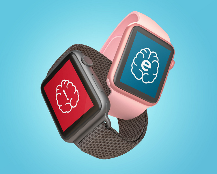
Epilepsy+Me App
OVERVIEW
Challenge
The challenge of this project was to create a visual solution for an app that allows people with epilepsy to be more self-sufficient. Approximately 331,000,000 people worldwide have epilepsy with 3,000,000 of those people being in the United States. This is meant to be useful to people who have epilepsy.
Goal
The goals of this project are:
To show the user’s medicines.
To show the user’s appointments.
To be able to call an ambulance if a seizure is happening (this is based on the fact that some smartwatches can monitor brainwaves).
To be able to be viewed on smartwatches as well as smartphones.
Role
This is a solo design project where I was responsible for the visual design of the project.
DESIGN PROCESS
The Steps
Ideation
Visual Research: Colour
The colours I chose were meant to create the feeling of relaxation and so I chose blue as the main colour.
Colour Style Guide
Visual Research: Typography
This project uses Roboto due to it being easy to read.
Visual Design
Epilepsy+Me High Fidelity Phone Screens
Epilepsy+Me High Fidelity Watch Screens
Prototype & Test
CONCLUSION
Summary
Outcome
The final result is a mobile app with a smartwatch component. This app monitors things such as their medication schedule and their appointments. It also comes with a companion smartwatch app that monitors their brainwaves so that it will be able to tell if they were having a seizure and alert their phone so that it would make a 911 call.
Final Thoughts
This project came with a slew of challenges, namely, how to design screens for a smartwatch. At the end of it, I got to understand how the smartwatch interface works. However, and more importantly, I have been able to look back and see where I would make different choices if I were given a similar task.


