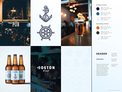
Boston Pint - Visual Redesign
Role: Visual Designer
Timeline: 3 months
Tools: Adobe Illustrator, Adobe Photoshop
Draiocht
A brewery, serving a wide variety of alcoholic beverages, in a friendly and inviting atmosphere.
What is Draiocht?
Draiocht is a brewery based in Massachusetts. A local, family run, brewery with recipes that span generations. Additionally new modern recipes for; IPAs, ciders, and hard seltzers. Draiocht aims to provide a friendly environment for families, friends to meet up and enjoy a good drink.
Why the Rebranding?
Draiocht is a growing company based in the Boston harbor area. Their current visual style is very outdated, disorganized, it has no unity, and the name Is difficult to pronounce, hard to remember, and the meaning behind it is unknown to most of the audience.
The Process
Research
Before starting the process, I started gathering information about the industry, the products and services being provided by Boston Pint, as well about the Boston area, Massachusetts, Irish culture, and bar culture.
Ideate
I started looking for words, ideas, and names to describe Draiocht. I was looking for words that would reflect the values the company is trying to show, locations and areas connected to the company, and goods and services they provide.
Out of all the ideas, there were two that were catchy, memorable, Boston Pint and Liquid Luck. I made a short survey, and the majority of the votes went to the Boston Pint, which was my personal favorite. After deciding on Boston Pint for the brand, I began working on the logo, started making sketches, and gathering ideas.
Develop
Sketches
Using the sketches I created earlier, I chose the best ones, grouped them and then tried to recreate them as vectors. The ones I felt weren't as good to make the logo, I recreated them as illustrations and patterns.
Logo
From the sketches I picked out 3 main ideas to work on, and eventually decided to pick one of them and commit more work towards and finalize its look. Once I finished the logo, I Started working on the color guide, pictures, mockups, illustrations, and worked on the typography.
For the color scheme, I chose white, blue, and orange. White, represents cleanness and modern minimalistic design. Blue represents loyalty, trust, confidence in their craft, and is related to the sea. While orange represents enthusiasm, joy, and is a great supplementary color to blue, the contrast it creates draws people's attention. Then, I created the illustrations which I later on used in some of the mockups, created the typography, created a theme for the pictures, and finally the mockups.
Revisions
Lastly, I went over a few minor revisions, proofread all the text, and fixed all the mistakes that were left. With that I completed the visual redesign of, now Boston Pint.
Thank you
for tuning in!
