Long Form Design
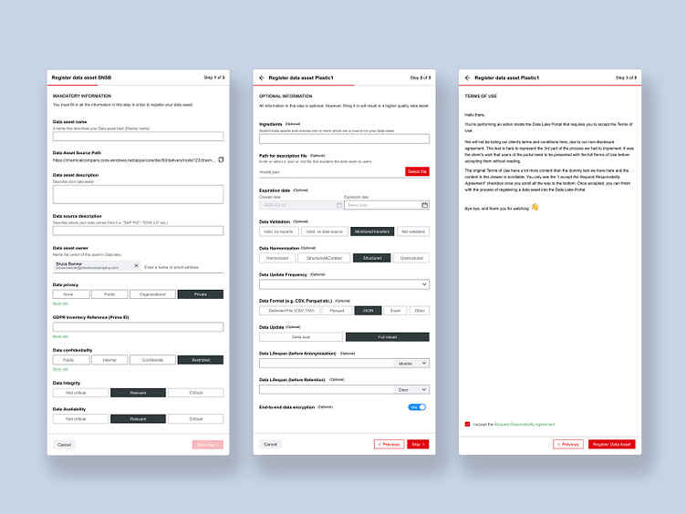
Our task was to digitize a currently manual process within a corporate setting. We could not decrease the amount of information requested by the client, so we split them into three parts:
1. The 1st step is for all the mandatory data the user needs to fill in to finish the registration process;
2. The 2nd step is for all the optional data which the user can skip and come back to later on if they need to;
3. The 3rd step is for the Terms of Use the client wanted to present the user with at the end of the process.
A common issue when designing forms is their size and amount of content. As designers, we want to make the information as digestible as possible. One way to do this is to split the process into several steps. This way, we do not overwhelm the user with the amount of data requested and increase the odds of them finishing the process.
