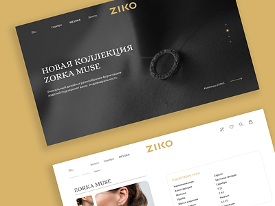
ZIKO page
Hey, guys!
I am glad to share my research on the design of the Jewelry Store's website. It was very interesting to work on this project. I set myself the task of studying products, composition and typographic style more deeply, which could be a solution for a good display of content and information. It looks simple, not overloaded with design. Created the main page and a grocery card.
I am waiting for your reactions! :)
More by Anastasiya Herasimova View profile
Like
