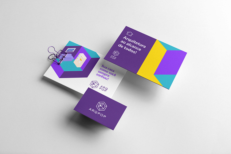
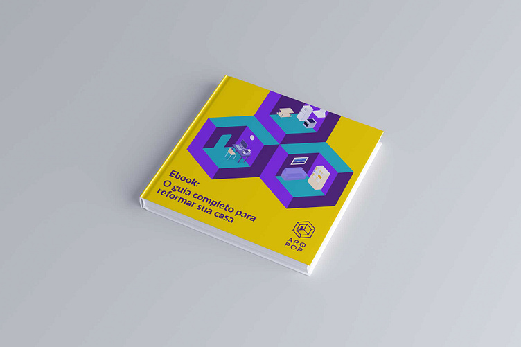
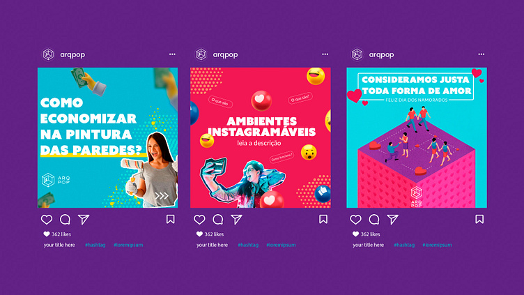
ArqPop - Brand identify
ArqPop brings an innovative solution in architecture, a new way of bringing architecture to the population, offering value through rich content and valuable tips about real estate renovations and constructions, and will resolve people's objections about the architect's duties. Right solutions for the demands; Savings in the budget of the works; Satisfaction of being able to leave the environments as you always dreamed.
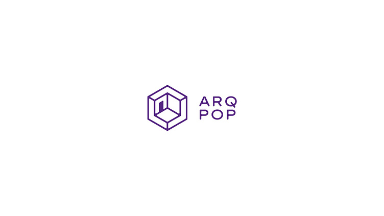
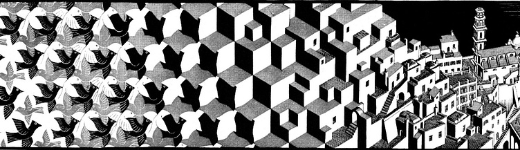
Representing an environment in the visual identity was an idea that was present since the beginning of the project, in the drafts it sought to represent both internal and external environments. Both architecture plays a key role.That's why the inspiration came from the artist ESCHER, who in his works manages to play with our vision and with optical illusions caused by our brain. It was inspiration for the logo as a way to show the indoor and outdoor environments of a home.


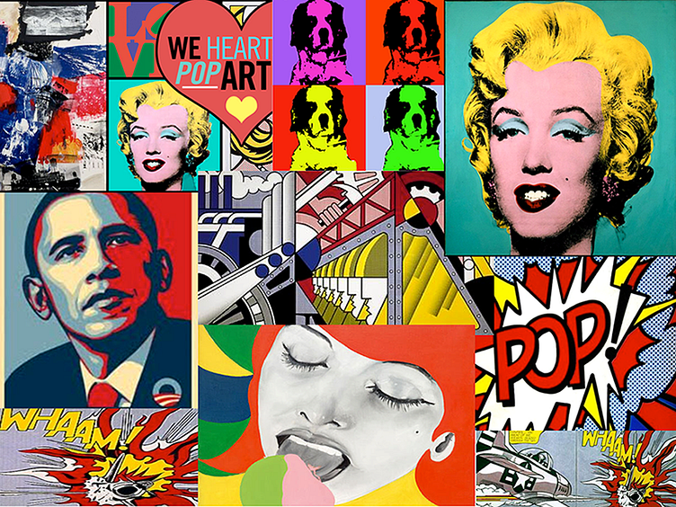
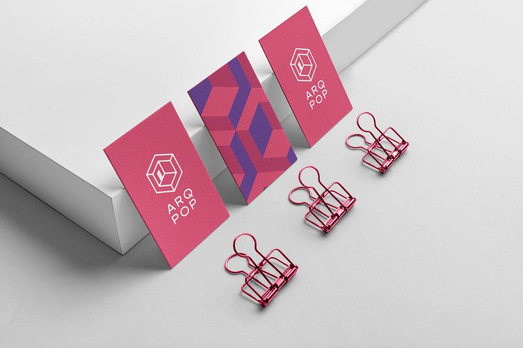
The Project was inspired by pop art, it is a artistic movement that is lively and Stripped, characteristics desired in ArqPop's visual identity.