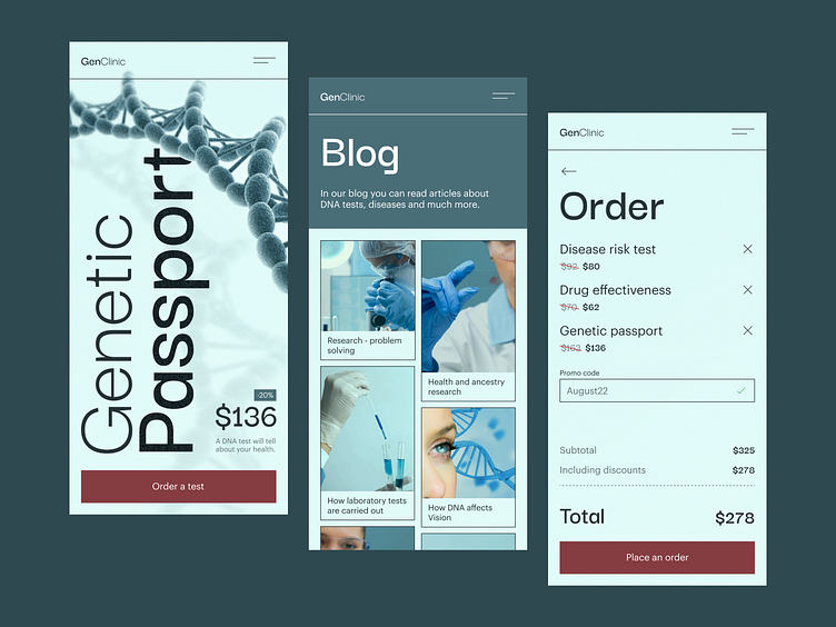
Biotech Сompany Website – mobile version
💌 Have a project idea? We are available for new projects!
hello@ronasit.com | Telegram | WhatsApp | Website
Like many other industries, the healthcare industry had to automate most of its processes using digital solutions because of the COVID-19 pandemic. Meet our new healthcare app that allows patients to search for medical services and pay for them online. Let’s explore the concept.
The first screen promotes a genetic test. It displays the price of the service and a CTA button. The next screen displays the list of the blog posts. The third screen displays the list of the services picked by the user and their total price.
Our designers chose the cold bluish color palette for this concept and accented the buttons with warm red. We chose this color palette because cold shades are always associated with healthcare.
The clean and well-balanced UI will make this app pleasant to use. It has all chances of catching the attention of potential users.


