Finance Dashboard Design - Salex
Hi Dribbblers 🖐
This is my Exploration for Finance Dashboard Design for SaleX. How about you?
Hope you guys enjoy and press "L" if you like it😄 Any feedback or comment? Feel free to leave comments below.
_______
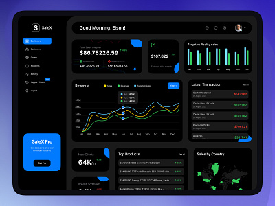
Side Menu ― In this side menu, you can navigate all of the menus you need. And, at the bottom of the side menu, you can upgrade SaleX Pro.
Top Section ― Every time you login your dashboard it's welcome you based on your time. top left you can see your profile photo, notification icon and, message icon.
Main Screen ― On this main screen, you can see all of your statistics in the graph chart like; Total sales, total revenue, total expense, and recent transaction. Also, you can see your top product, new client onboard, your overdue invoice, sales by country, and many more. You can go through all the sections in detail by clicking each card.
_______
Feel free to say hello 👉 anamul.ipa@gmail.com | WhatsApp | Skype
Available for remote opportunity 🙋♂️
_______
Become a part of my communities: