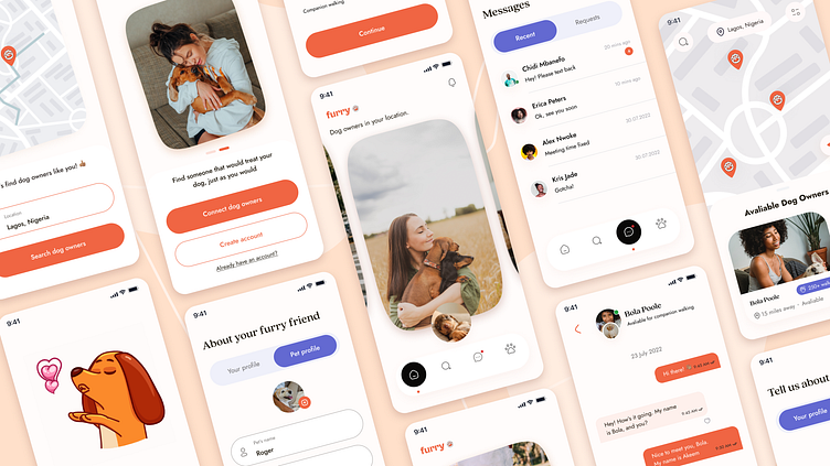
Furry - Social App for Dog Owners
Hey 👋
I am excited to share my design process, working on Furry - a mobile social app for Dog Owners. The app helps Dog owners connect and meet up with other dog owners, providing pet care to one another.
Role: Product Designer | Tools: Figma, Google forms | Timeline: July - August 2022
Introduction
The design brief was to design a Dog walking application for Dog owners to find dog walkers in their location. However, due to the inability to readily find dog owners in my location, I realized there was a gap I could fill with my design. Therefore, I set out to design a social mobile application for Dog owners to find other dog owners in their location, connect with them, walk their dogs together, and also find dog walkers and other pet services.
In comes, Furry, a social media-like application for Dog owners. The problem Furry intends to solve is simple - help Dog owners connect with each other, and find pet services that fulfill their needs.
The Problem - Finding Pet Owners that Care
To better understand the pain points of my users, their needs, and goals, I conducted User Research by crafting questions and distributing them to gather responses via Google Form. My questions ranged from the following:
Their experience using Dog Walking applications
If they feel comfortable leaving their pets in the care of other Dog Owners
Limitations and current constraints as a Pet Owner in Nigeria, etc.
From the user research, I was able to deduce that;
The Solution - There's love in the Community
Based on the user feedback and data I got from my research, it became evident that though the Dog community in my location (Lagos, Nigeria) is pretty small, and as such, Dog owners want to find each other, connect with one another, and provide pet care services and general help to one another.
One of the interview respondents said: "I'll trust a fellow dog owner with my dog because I believe they would treat my dog, just the way they treat theirs".
This statement, sealed the idea for me, to design an application that solves this problem, provides for these needs, and more.
How was I going to go about this, you might ask?
Well, I leveraged the power of communication, word of mouth & sharing. Existing dog owners on the application can share referral links, and invites to other dog owners, to join the platform, complete their verification and become matched with dog owners in their area.
This was achieved, by using GPS tracking feature, to show results of Dog owners within their location, just as the popular ride-hailing services do.
Success would be measured by the number of new invites and sign-ups to the platform, and the number of completed walks.
To brainstorm further, I allowed my creative juice to take a full swing on Figjam.
The next step after this, was to create a User persona, that spoke to my target audience, and summarised their goals, frustrations and needs. Doing this was imperative for me, because I personally always use user personas as a reference and guide throughout my design process.
Armed with all the information, it was time to nail the UX and make the process of finding dog owners smooth and easy. Hence, I created a user flow chart, showing steps for the onboarding process, a key feature flow in the application, and the process of signing up via a Referral link. The user flow chart set the stage for hand-sketching the wireframes, before diving into Figma to work on the low-fidelity wireframes.
Design Superpowers
To start off the UI Design, I had to have a theme and direction. I created a mood board, around my color choice, typography, and the general look and feel of the application. 🎨
The goal for the UI design of the application was to be young, vibrant, happy, and safe. Hence, the use of the orange color, happy and mushy images. The typography and other elements of the design also had to speak to the vibrant and happy theme for the application.
Style Guide
Below are more design elements, and components library for the UI Design. Doing this helped to maintain consistency around the application, and just made the design process a lot more effective.
Usability Testing
For the usability test, I designed 2 task scenarios around using the application, and how easy it is to search, and find dog owners in a particular location. Based on the feedback, I iterated on the search screen, as most users dropped off on that screen when they didn't know what to do. I updated the screen and made it more informative - showing available dog owners.
Below is the iteration on this.
Key Takeaways
One of the biggest takeaways from this project is rethinking the problem statement, and coming up with a product that solves an actual problem - based on user research and competitive analysis.
Product design is an iterative process and is about solving problems for the users. An app shouldn't just look pretty, but speak to the needs of users and solve their problems, by actively putting yourself in their shoes.
As a step further, I'll introduce more security options/ features for this application, as the app deals with people, and relationships.
I learned a lot, from doing this project, majorly improved my research skills, and learned a ton of new UI tricks on Figma. I also practiced the new updates to Figma Auto layout and made sure the app was super responsive and ready for developer handoff.
Thank you so much for reading. ❤️
😊 Would love to work on your next project! Let's connect on LinkedIn


