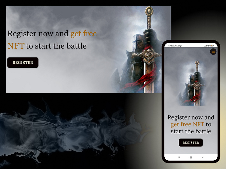
Call to Action block for the website
Hello, guys! 🖖
My last project the website Crypto Knights was a landing page. The landing page always should have a selling structure and help the user to make the targeted action. For those purposes, I usually use the Call to Action block with the button.
In this landing page, I used graphical elements (mist texture and the knight) to make this block heavier and more attentive in the meantime. In the mobile version, the layout became vertical and centered.
⬇️Subscribe⬇️
More by Dima Lytvyn View profile
Like
