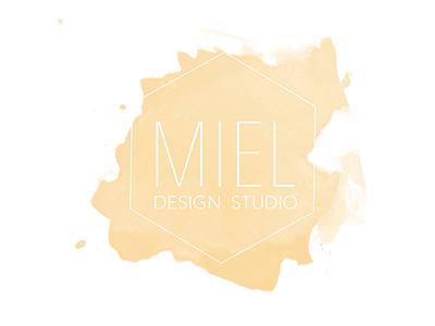
Miel Design Studio
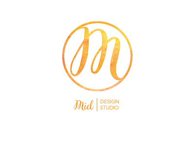
Kept the watercolor feel but made the letter clearer and the lines thicker. The "M" echos the shape of a honey dipper or a bee trail.
Kept the watercolor feel but made the letter clearer and the lines thicker. The "M" echos the shape of a honey dipper or a bee trail.
