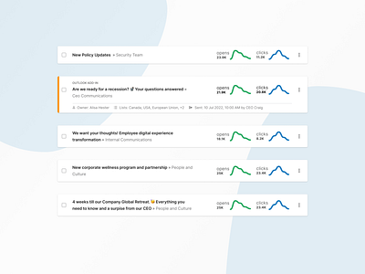
Sent Emails: Card Design
Exploring a couple different variants to update our current card design. The primary changes to this card were being made to meet AA accessibility standards. Since we were updating the design we also wanted to address some of the user feedback we'd received, improve the information architecture, and modernize the look and feel.
Some of the key changes that were made:
✨ Edited hover interaction so that no information would be hidden on hover
✨ Improved the subject line and folder IA to provide clarity of the relationship
✨ Moved information that was helpful but not critical to only show on hover
✨ "Last interaction" information was removed because users did not find this information useful on this view
More by Jenny Minke View profile
Like
