Split Button
Small design system component share while I work on some larger projects. :-)
The Split Button is here for all of your "I have multiple actions, but one that most folks are going to take most of the time" needs. It sits between a Dropdown Menu and a basic Button, and can be a great tool for simplifying sets of actions without losing navigability.
Nielsen Norman has a great article that I won't rewrite here, if you're interested in using a pattern like this in your projects, check it out.
How we built it
The Split Button has two main sections: the Button, and the Menu. The Button is built very similarly to our existing Buttons, with an auto layout frame containing text, and an icon (controlled via a Boolean property so it can be toggled on and off easily). We use shadows to create focus states, which helps reduce the number of layers necessary to get all the states we need.
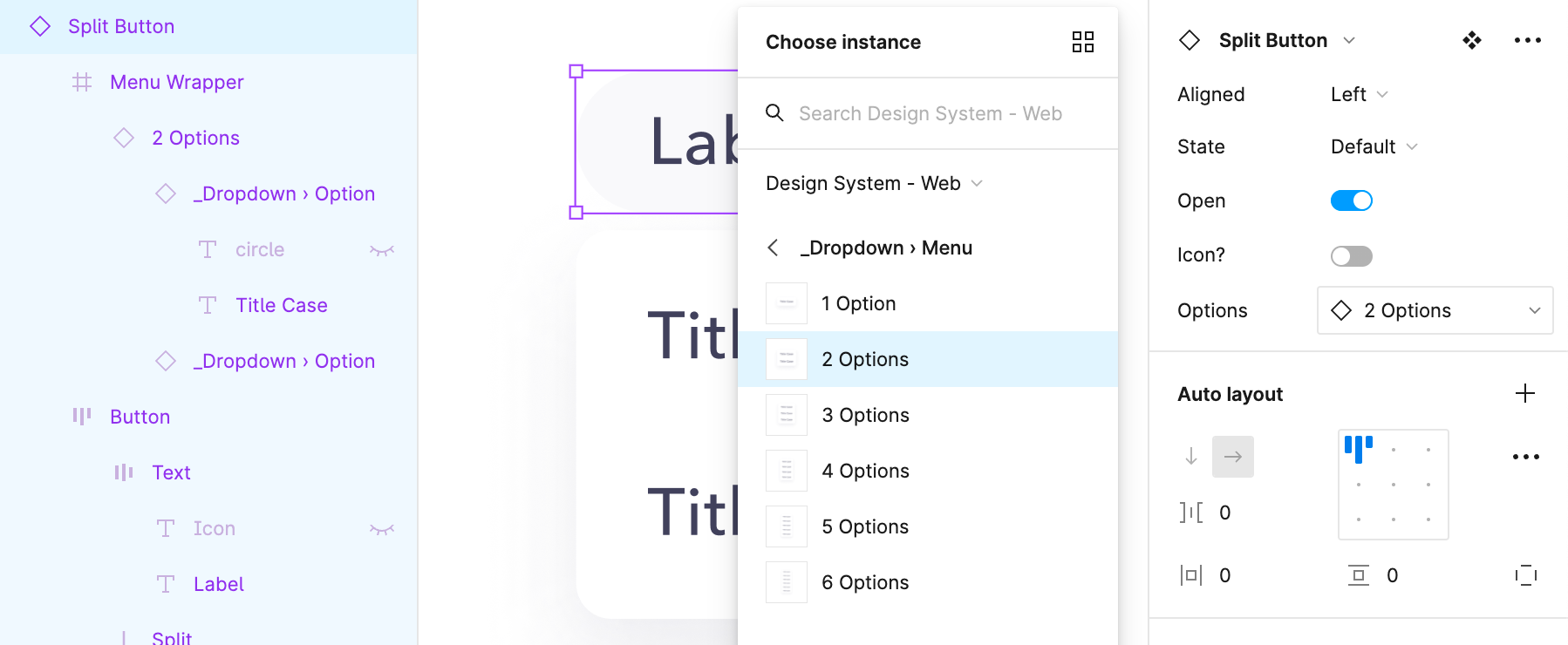
The Menu is more interesting—we don't want the component's dimensions to change when it's opened or closed, so the menu exists within a zero area wrapper frame, like this:
The zero width frame lets us effectively absolutely position the menu a few pixels below the button (when open), and arbitrarily change it's dimensions without worrying about the main component pushing any other layers around. Figma won't let you set a layer width to 0 (as of this writing), but it will automatically round 0.00001px to 0px. 😉
We wanted to give designers control over the alignment of the menu (left or right) as well, which is easy enough—just move the Menu Wrapper layer to the other side of the button (all wrapped in an auto layout frame at the "Split Button" layer), and adjust the rules in the Constraints panel of the Menu Wrapper. As the Button expands, this lets the menu remain positioned correctly.
We also utilized the new instance swap property to manage menu lengths. Rather than creating a new component set for each variation on the number of options, we can instead simply create a "_Dropdown › Menu" variant (underscored so it's not published with the library) that designers can choose from at the main component level (rather than having to drill down and find the exact controlling layer).
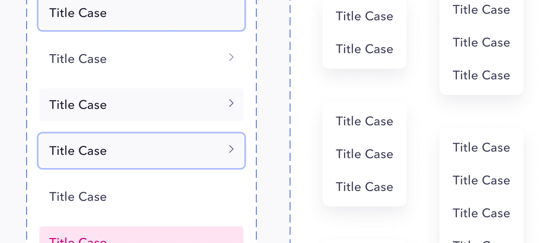
Designers can then easily adjust how many options they'd like in their menu. Each of those option menus also contains a subcomponent for each "_Dropdown › Option" which lets designers select individual options and adjust them to include all sorts of other properties, like states, icons, and more. This leads to an incredible amount of variation that designers can employ (as well as out of the box interactions, like hover states everywhere).
We can then also reuse these options and option menus in other menus of similar type, like Dropdowns. This reduces the amount of maintenance and work for designers and engineers.
Anyways. Hope this was helpful / interesting. If you found the breakdown useful, or have questions, let me know in the comments—happy to expand or help out.
The design team at Mercury is hiring by the way. We don't have dedicated design systems folks, so if you like working on interesting product problems and design systems, you should join us.
– Alex ✌️


