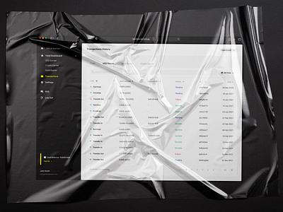
Transactions screen, UI/UX Fintech design | Merge Development
Hello, everyone 👋
Our today's Dribbble post from Merge is all about transactions. Given that the project is a fintech product based on blockchain and decentralized finance, making our transactions design minimalistic and extra clean was our priority.
All users have to do is sort them by type, amount, and status. No redundant actions whatsoever.
There's more to come soon! Stay tuned for more updates! See the full case on Behance.
Also, check out our other social media below or email us at hello@merge.rocks. Take care and see you next time!
Merge Development | Merge Blog | LinkedIn | Facebook | Instagram | Behance
More by Merge Rocks View profile
Like
