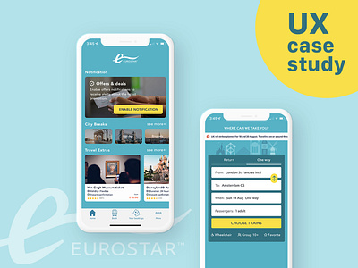
Eurostar | Booking App UI Redesign
Studying UX ✍🏻 & getting used to 🇬🇧 life
In this case, I mainly redesigned the Home screen in order to provide more sales and travel information. I applied the card design so people can easily browse through the categories. Also, I made the notification button looks more unified and clear.
More by Liu Chia Hua View profile
Like
