Doggma | Dog Walking App | UX Case Study
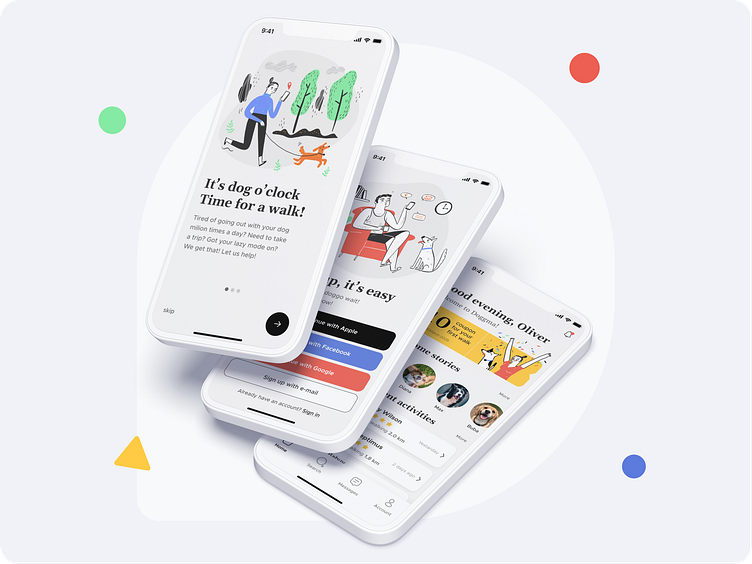
Doggma is a mobile iOS app designed to help dog owners find verified and trusted dog walkers nearby. Throughout the project, I performed market research, conducted user interviews, created user flows, wireframes, and visual designs. Subsequently, I built an interactive prototype and tested it with real users, which led to several iterations based on their feedback.
“I like dogs. You always know what a dog is thinking. It has four moods. Happy, sad, cross and concentrating. Also, dogs are faithful and they do not tell lies because they cannot talk.”
Mark Haddon
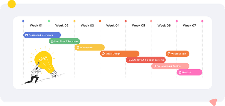
Project Timeline
I was given seven weeks to complete the project, but the process was far from linear, and if given the opportunity, I would have loved to iterate on it even more. In terms of time allocation, it looked something like this:
Competitive analysis
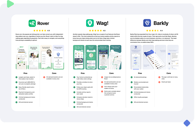
During the project, I placed a strong emphasis on competitor analysis in order to better understand the product and design a more effective MVP. To gain insights, I personally tested three mobile applications and spent significant time reading user comments on the App Store. Based on my research, I found that Rover had the highest user rating, and I incorporated some of its most well-liked features into my design to improve the overall user experience.
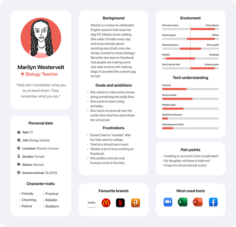
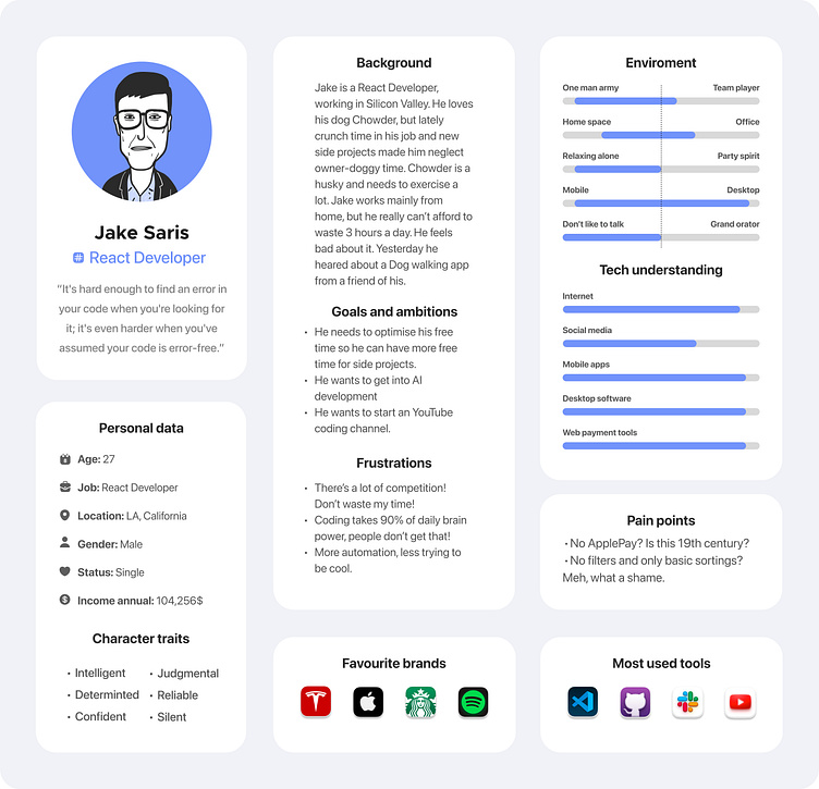
User Personas
Creating user personas was an essential step in designing a product that meets the needs of its target users. To develop these personas, I conducted thorough research and gathered insights from interviews with dog owners and dog walkers. This allowed me to gain a deep understanding of their goals, motivations, and pain points. From this research, I was able to create two user personas that accurately represent the target users of the product: a dog owner and a dog walker.
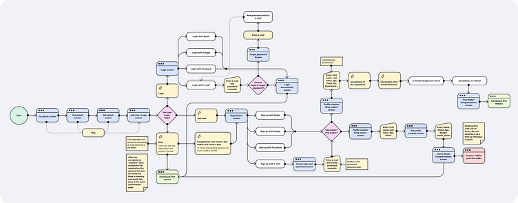
User flow
To ensure a seamless user experience, I created a detailed user flow that not only mapped out the necessary steps to go from point A to point B, but also accounted for additional processes that were necessary for the project's success. For example, I included background checks for new dog walkers and the ability to add a coupon for a user's first walk. By incorporating these important features, I was able to ensure that the end product vision was fully realized and that the app would be user-friendly and intuitive.
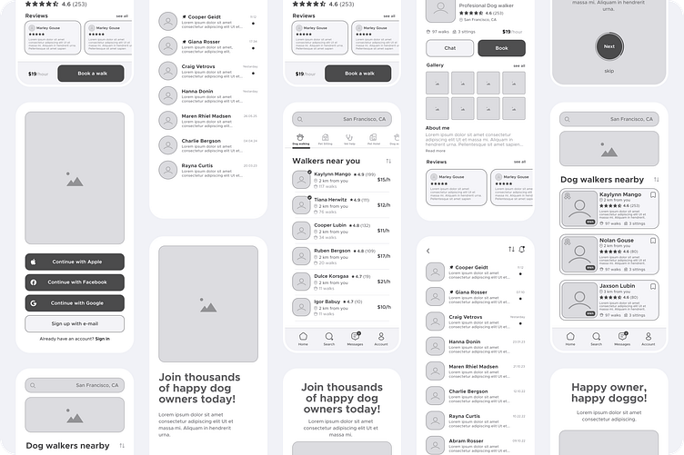
Wireframes
Before I began the visual design stage of the project, I dedicated a significant amount of time to wireframing. I believe that this stage is crucial to creating a successful product, as it allows you to see the overall structure and layout of the app before getting bogged down in details like colors and typography.
Through wireframing, I was able to fine-tune the user flow and make sure that the essential features and functions were in the right place. It also helped me spot any potential issues with the interface before the design was finalized, saving me valuable time and resources down the line.
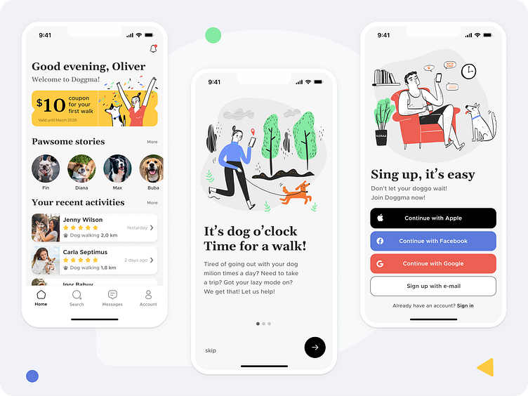
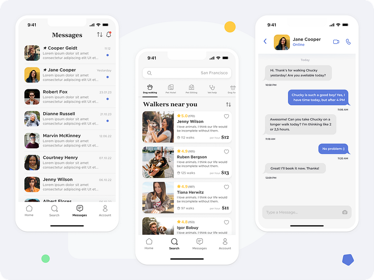
Visual Design
After the wireframe phase, I was ready to move on to UI design. I had a clear idea of the overall look and feel I wanted to achieve, but I still had a lot of work to do to bring my vision to life. I started by experimenting with different color palettes and fonts until I found the right combination that would give the app a minimalist and optimistic feel.
One of the things I found most surprising was how much easier the UI design phase was once I had completed all the previous stages. By that point, I had a deep understanding of the product and its users, and that knowledge helped guide my design decisions. I focused on creating a clean and simple interface that would be intuitive and easy for users to navigate.
Prototyping
After completing the Visual Design phase, I moved on to creating an interactive prototype in Figma. The ability to test the prototype with different users and observe their behavior was invaluable in identifying potential problems and areas for improvement. I conducted several rounds of testing and made changes based on user feedback to create a better user experience.
In addition, I added some micro-interactions to the prototype using After Effects. For example, I created an animated logo for the first-time app start, which added a unique touch and provided a more polished overall look and feel to the app.
Project Summary
During the Dribbble Product Design course, I was able to expand my knowledge of the latest design trends and practices. I had the opportunity to ask questions and learn from experienced designers at top companies such as Google, Instagram, and Twitter. This was an eye-opening experience that allowed me to gain valuable insights that would have been difficult to acquire otherwise.
In addition to learning from experts in the field, I was also able to apply the knowledge I gained to this project. Through market research, user interviews, wireframing, and visual design, I was able to create a product that met the needs of its target users. The interactive prototype testing phase allowed me to refine the design and make it even more user-friendly.
Overall, this project was a great opportunity for me to put my design skills to the test and continue to learn and grow as a designer.
contact me: michalriskedesigner@gmail.com
