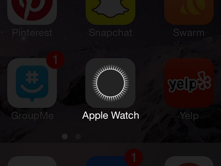
Apple Watch Icon
An unofficial "rebound" of the Apple Watch Companion iPhone app icon that was posted yesterday.
See Mark Gurman's (9to5mac) tweet... https://twitter.com/markgurman/status/562335722166702080
I felt the "cartoony" side-view of the Apple Watch was an odd choice for the companion app icon. Not very iOS 8 if you ask me.
The proposed solution here better represents the watch, highlighting the "breakthough in user-interface"... one of the key features of the Apple Watch... the Digital Crown.
Thoughts?
More by Thomas Phan View profile
Like
