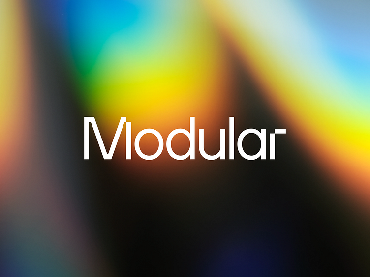
Modular Brand
Hey Dribbble 👋
Sharing some of the brand work the team at MetaLab recently completed for Modular.
Brand Design - Esther Brener
UX/UI - Mariana Gomes
Motion - Rob Diaz
A little introduction
Modular is the next generation AI developer platform founded by the best and brightest in AI.
The team behind Modular are shifting the current paradigm of AI by reinventing and rebuilding the software from the ground up. It was such a joy to help verbalize and visualize that driving force.
We knew from the earliest conversations that our work needed to amplify the inspiration and excitement around the future of humanity and AI’s role in that.
The Modular team is an incredibly talented and diverse group of individuals. Their passion was infectious from the outset and we couldn’t wait to dive in and help build and craft their story.
Here’s how we aimed to humanize AI through brand.
Word mark, symbol & visual language
Everything in the universe begins with an atom, the basic unit of matter.
In Modular’s field, everything begins with a ‘bit’, the basic unit of information. When you merge these together, you have a common visual basis that bridges both archetypes. We felt this created a single design primitive that we could build from. Something that broadly connected with all of us in building out a common modular, composable, and layered design system.
The bit and atom fundamentally inspired the brand’s look and feel, becoming the unit or the module, upon which everything is built. From our grid system to our logos and visual language, it all comes from this lowest construct or primitive, represented visually as a simple square — but the basis upon which an enormous design language can be built.
The word mark is stripped back and clean, with lovely little details. The ‘bit’ missing out of the M and the R are a nod towards its construction and are later found throughout the visual language. We wanted to create an understated word mark with a more playful and abstracted symbol that can forever shift, build out, and evolve.
Modular is the foundation on which anything is possible, so it wasn’t about creating a flash and exuberant mark, but one that encourages others to build something magnificent from it. The software that Modular is creating is modular (of course), composable, and layered and we wanted to build a design system that perfectly embodied that.
Color palette
Modular’s color palette was inspired by the raw magnificence of nature and the enormity of space. This is a nod to our infinitesimally small existence in comparison to the vast enormity of the Milky Way. Yet, one which draws hope to human exploration and a better future with AI. We look to the stars as a symbol of all that is possible.
The palette is set in a beautiful deep blue, embellished with the color of starbursts and gas clouds for accents. Not only did it feel fresh and different from the generic mid-blues of the field, but it also leaned into Modular’s overall aim to inspire software developers and hardware providers to create amazing things that will improve people’s lives and move humanity forward.
Typography
As soon as we laid eyes on TT Hoves, we knew it had to be our typeface. Hoves is clean, elegant and well-balanced, with plenty of lovely geometry and very little noise or unnecessary embellishment. It feels ‘of the future’ without any gimmick.
We leaned into the lighter weights, from hairline to regular, combining it with plenty of breathing room and we’re incredibly happy with the results.
Visual language
The visual language is built upon the use of two types of graphic devices constructed on a square grid system. Solid color blocks and jagged imagery.
The grid brings order and helps portray the concept of modularity in a visual way, whilst allowing flexibility in a plentitude of layouts.
The beauty of this system is that it extends to a number of different shapes and provides flexibility to frame imagery, create intriguing masks, and ensure the visual language can evolve and stay fresh.
We felt that imagery was key to the overall story of AI and its impact on humanity – something many companies in the space seemingly miss. For this reason photography is a key element of the brand and is utilized heavily to reflect the use case or impact of what is being represented.
Iconography
The bespoke iconography set is designed to feel like an extension of the logo. The icons match the brand’s blocky visual language, mimicking the feel of being built by bits. Icons also fit into the overall design system to ensure we create echoes of modular, composable, and layered composition.
Website
As the brand developed, we started to build out the website, using block-frames, wireframes and content documentation. Our teams never work in silos, so conversation and decisions flowed back and forth, between brand and product.
Flexing the fledgling brand work into the context of a marketing site, helped to sharpen our output, ensuring it fit the purpose. We also wanted to ensure that we’re capitalizing on opportunities for delight and interaction.
Conclusion
It was such an incredibly daunting and equally inspiring undertaking to build a modular design system that is reflective of the software and platform that the Modular team is creating.
The ability to craft a visual language that will be utilized in the broader developer platform — from the documentation, to other flows that the team is building, provides a unified language that elicits a visual story which is reflective of the future of AI software.
The future of AI depends on modular design, and we are proud to have helped create a brand that beautifully encapsulates a company that is pushing forward the world of AI infrastructure. We believe they can bring a better world for everyone and we are deeply rooting for them.
Read more about our collaboration over on Modular's blog post


