Promo Page for Conference
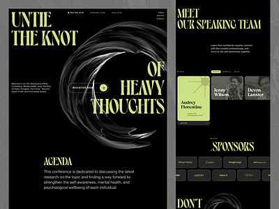
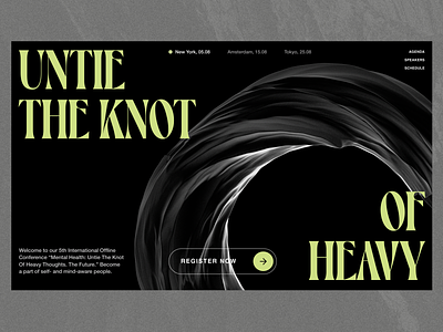
Hey, folks) I'm back to tell you more info about the main visual for the promo landing page.
I wanted to create a generative 3d object with complex texture and dramatic lighting. As a result, it was possible to integrate such an object into the design concept quite nicely. Because of its massiveness, it complements the overall design, and its compound texture blends perfectly with the main font.
Hope you liked It, don't forget to press ❤ and share your thoughts 😊
Website | Join our Newsletter! | Crappy Explanation Playlists App | TheGrid | Spotify | Twitter | Medium | Facebook| Instagram
More by Zajno View profile
Like


