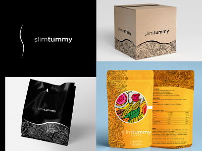
Slim tummy product packaging
Slim tummy is a brand that makes products that help people have healthier bodies and they needed a simple, flexible and adaptable typography word mark to represent the brand. My approach was a visual pun on the brand name, combining a slim version of the font with a thick version. A Sans- Serif typeface Gothic Rounded was used to create the logo, because it is easy to read, and its rounded and curvy appearance would appeal to the brand’s target audience .
I also created a brand element, a well shaped S, to represent the slim curvy body they are trying to sell, this can be integrated into the brand in creative ways.
I also created a doodle for the brand, morphed into a brand pattern that I applied on print materials and finally worked on a really attractive packaging design to house the tea product.
