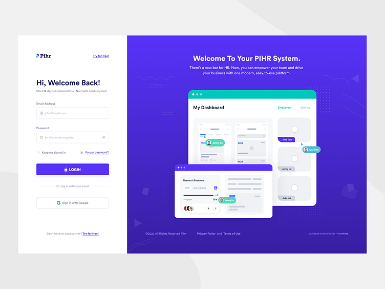
Sign Up Page — UI
Sign-up page with the Admin Dashboard. This layout is a little more visually interesting than a simple sign-up form, and the space on the left can be utilized to show off the product UI, features, or customer testimonials to add a little bit of social proof.
Hope you like it and feel free to leave comments and feedback.
Thanks! :)
Available for a new design project
Let's Talk: anwar.uiux@gmail.com
Interested in seeing more real projects like this one? Follow Me 😎
Login Page Active
Typography
Each time the selection of the appropriate typography is preceded by proper research. In the Pihr project, we decided to use a modern sans-serif font with a geometric accent - Circular Std. Typography is strong, legible, geometric, and consistent with visual identification.
Login Page Email Error
Color Palette
Based on the visual identification of PiHR, we have developed a color system that we have adapted to the new user interface. A strong accent in the form of "glowing" Blue & green breaks the basic colors of the project - gray and black. We love such color combinations!


