Mane apartments - Logo

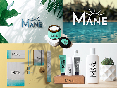
I made a logo for seaside apartments.
My goals:
-to create a brand
-make it modern, elegant, and simplistic
-tie into the design sea and sun vibe
Logo:
For the font, I used Josefin Sans with some adjustments.
The Logo represents the coast, the mountains, and the vicinity of the nearby party place. It's simple and elegant.
The logo was made in Adobe Illustrator.
Mockup:
The colors I used for the logo are black, dark gray, and white.
I used a teal accent color which is used in the apartments for which the logo was made.