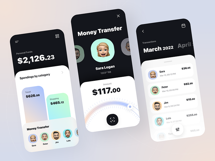
Mobile banking app design
Digital era opens us new possibilities for contact-free and automated interactions. Our team came up with a concept for a banking application to transfer money quickly and effortlessly.
We used contrasting colors to highlight key areas on the screen, making it convenient even for a first-time user to navigate the app. Gradients are used to represent a “neo” bank, futuristic and unrealistic. The idea, that the world is moving towards digitalization, inspired our team to design the interface using memojis, instead of pictures.
Find more works here.
💚 Drop us an email at info@selectoglobal.com
More by SELECTO View profile
Like
