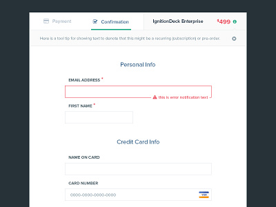
Checkout Form
Dear all dribbblers, I am back after a short break. Today, I would like to introduce "check out" form. The request is to suit vary styles because it will be a part of different sites. So, I choose minimalism.
Designing check out page is not easy as I thought. We have to make it simplest, but it has to have enough information and be easy to be re-checked by users. I hope you will like it.
Please view attachment for real pixel.
Thanks for watching my work and if you like it, please follow my Dribbble | Behance
More by Hoang Nguyen View profile
Like
