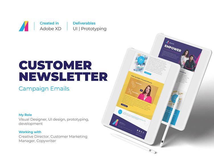
Absorb Customer Newsletter
Background
Absorb Software is dedicated to empower people and organizations to excel through learning. For that purpose, Absorb LMS was designed to set new standards in both eLearning software and support, as we believe anything worth doing is worth doing fanatically well.
To keep our clients informed about updates and new features for the Absorb LMS as well as news and events related to the company and the elearning field, the marketing team sends monthly newsletters to our clients to keep them up-to-date.
The Brief
How to make the customer newsletter more engaging?
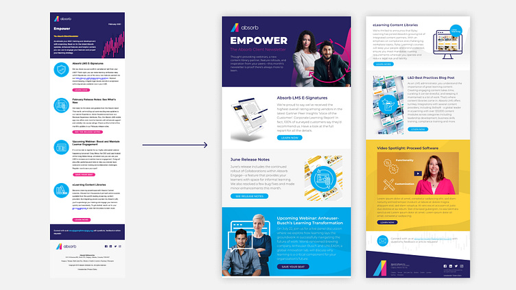
The marketing team wanted to refresh our customer newsletter template in order to update the styles to match our current brand as well as to design a more captivating layout that guides the user through the content. The main goal of the project was to make the newsletter more engaging and exciting to boost click rates while having readability in mind.
Solution Ideation
Wireframes
A different approach to the usual layout
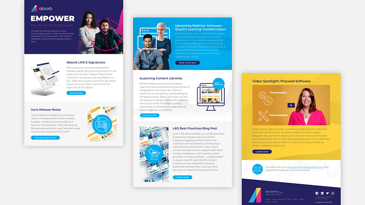
Based on the main goal, this new template needed to focus on four main sections:
New features and monthly release notes for Absorb LMS
Product launches
Partners spotlight
Events and Webinars
Having this in mind, I started my ideation process by creating very rough sketches on paper to get some ideas on how to structure the newsletter template in order to highlight the right sections and provide the users with the quick idea of what the section is about.
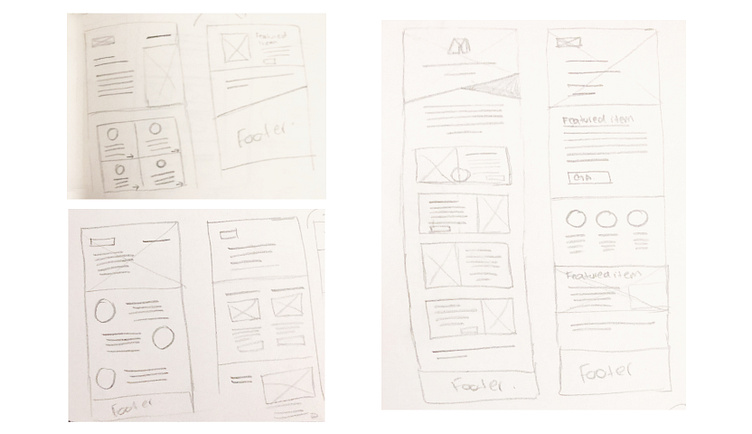
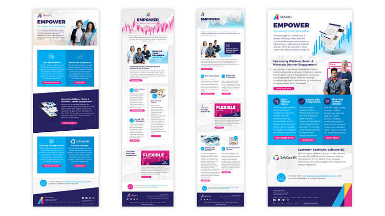
After some layout explorations, I started creating high fidelity wireframes using Adobe XD to get a better idea of how the information would flow in the newsletter. The idea behind these proposals was to try different approaches to the layout to engage the user with the content while making it more captivating without impacting the information.
Revisions
After the first revision, and more research on what is possible and doable on email templates as well as what the limitations are when developing the template to be reusable, it was clear the solution couldn’t be too complex in order to be properly rendered by email client providers.
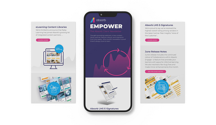
With this constraint in mind, we opted for a more balanced option that relied more on colors and subtle changes rather than a more convoluted layout. While the previous newsletter relied on icons to point at the different sections, I leaned more on using product and concept images to provide a better idea of what the topic is about and bring attention to the content.
Prototyping + Test
Creating the new template in Marketo
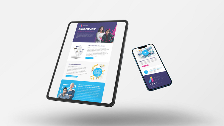
For my prototype and final deliverable, I coded the approved design in Marketo in order to test its functionality on different email providers and make sure the template could be easily edited by anyone in the team.
To make sure the experience would be the same no matter the email client provider, I tested the newsletter on Outlook for Mac and Windows, Gmail and Apple Mail. It was crucial for us that the email would not break or parts of it wouldn’t show up depending on how it was rendered, and through this testing we realized Outlook for Windows seemed to render the template quite differently in comparison to the others.
After some research and a couple of tweaks to the final layout, I found a way to have a fallback for Outlook for Windows that wouldn’t affect how it was rendered in the other email client providers. After a second round of testing to double check the changes worked, the updated newsletter template was first used in the third quarter of 2021 and it is a current asset used by the Customer Marketing manager to promote events, release notes and news about Absorb and our partners.
Lessons Learned
Working on the newsletter email template was definitely an interesting challenge for me. I learnt more about the limitations email templates have depending on the email client providers, which meant designing appealing experiences on a less complex layout while still looking for solutions on how to attract the users’ attention and providing a good summary at glance.
For this project, it would’ve been a good next step to corroborate our design assumptions with a/b testing so we could get a clearer idea of what sections the users are more interested about and perhaps which topics they would like to know more in upcoming newsletters. Perhaps with more time and budget, it would be a good idea to implement this step to keep improving our user experience for these types of marketing assets.
