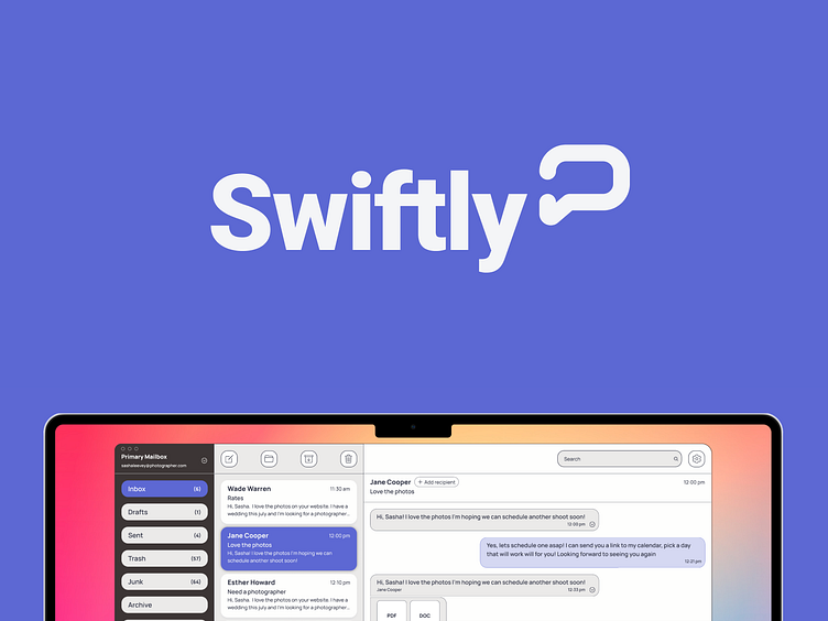
Product Design: Swiftly
How do other platforms solve the needs of their users? Where do they fall short? Let's analyze.
Why are you doing this competitor analysis?
To gain an understanding of email application features
What do you hope to achieve?
An understanding of what features are necessary, useful, as well as what is unnecessary and overly complex for our target user.
Will this research impact UX decisions?
It will provide evidence for what our application needs to provide a competitive advantage compared to the major platforms.
Microsoft outlook was analyzed to gain an understanding of features, user reviews surrounding pros and cons, as well as a critique of the application design. The analysis was performed off platform through image and web search and highlighted what market gaps exist. Overall, the analysis yielded a few important and useful insights.
Market Gaps & Insights
• The small business market is underserved
• Existing platforms are too robust to learn quickly
• User interfaces are overloaded with features
• Lack of intuitive features
• Redundant features
• Too much time required to manage
Takeaway
Focus on saving time for the user and making the interface intuitive so users spend little time learning how to perform tasks.
Four key concepts emerged from research insights
• Helping the user achieve inbox (0)
• Integrating features to save the user time
• Minimizing the format to make email more conversational
• Make organization easier and more usable
How does the user achieve inbox(0)?
How does the user communicate?
What does the interface look like if it's designed to be intuitive and full of time-saving features
Atomic wireframing of features
Insight concept: Achieving inbox(0)
The most common actions are easily accessible
Custom folders with customizable hotkeys
Insight concept: Save the user time
Preloaded responses, delayed sending of drafts, automating folder behavior
Insight concept: Making organization easier
"A place for everything, and everything in its place"
Customizable folders
Insight concept: Conversational threads
Decluttered messages with traditional accessibility and features
Emails with multiple recipients work in a singular conversational thread.
Disclaimers and signatures are hidden in expandable section
Outcome and Results
This was completed as a project for the Dribbble Product Design course. The application did not see an actual launch but provided insight and experience into the process and considerations involved in building a desktop email application.
User testing would provide further evidence of successes and shortcomings of the design, as well as insights into further feature development.
Some idea's to explore further would include integration with other messaging and task management apps like slack, discord, asana, calendars, and more.
Credits
Dribbble Product Design Course 2022
--
Thank you, Valerie Downs, for being a great mentor.
--
Thanks to my classmates for providing valuable insights during the research phase of the project.
--
Thank you, Jesse Showalter, for being a great instructor.


