Koelkebeck Farms
Project Details
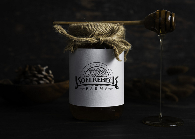
Koelkebeck Farms is a family business that focuses on offering a diverse range of products; all grown and handmade on the farm. They came to me looking for a logo that had a minimalist feel, rustic, and would look good in black for their packaging and marketing materials.
Organic, slow farming, self-sustaining, abundance, these are some of the words my client shared with me during the research and planning phase of the project. They wanted a logo that incorporated a cornucopia that contained illustrations of some of the products they offer.
Sketches and Concepts
I suggested an emblem style for the logo type. After a series of sketching and researching different types of farms logos, I presented two directions. The sketch in the above is the one they liked. Not knowing until pointed out by my clients, that the connecting Ks in the logo reminded them of their connection to each other. Since both of their first names began with the letter K.
Fine-tuning and Execution
After getting the outline right on the illustrative portion of the logo, I printed it out in order to do some line-work with the shading. This helped giving me a general idea in the program on where to add lines. Then I focused on the typography side of the composition. Found a serif font that worked well and drew the tails of the Ks and formed the connection. They loved the result.
Closing Thoughts
This project stretched me in a lot of ways. Printing the outline out and hand drawing the shading really helped my mind make the connection from sketch to digital. Sometimes looking at things differently can help get past mind blocks while you're in the process. And clients finding meaning in what you deliver. Meaning that you didn't know was there until pointed out.


