Email made simple
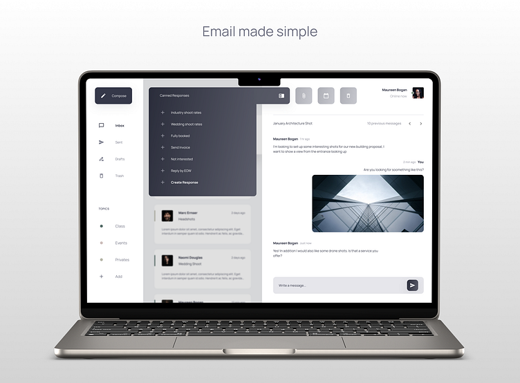
This is a Desktop Email app case study designed for the Dribbble Product Design course.
Overview
When software company Adobe surveyed over 1,000 American workers for its annual email usage study, they found that people, on average, spend more than five hours per day checking their email. Only 46% of respondents said they could clear their inboxes.
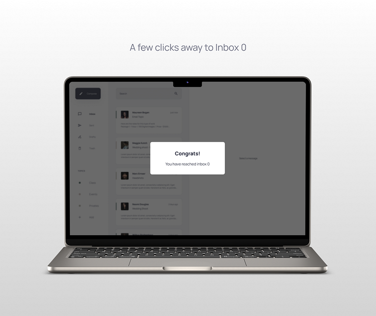
I wanted to investigate how to help people get their inbox to 0. As someone constantly chipping away at a mountain of unread emails, I have my methods of tackling the problem. However, I wanted to see how others navigate this endeavor.
Research
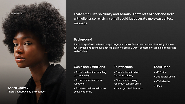
I was given a project brief and a user persona for this case study.
Problem Statement
The modern entrepreneur needs an email client that is fast, efficient, and a little less formal. Busy people would rather text than an email, and users need features that automate their emails to help them spend less time on email.
Project Goals
Operate like a texting platform
Threaded style chat view
Canned responses
Topical organization
Feature 1
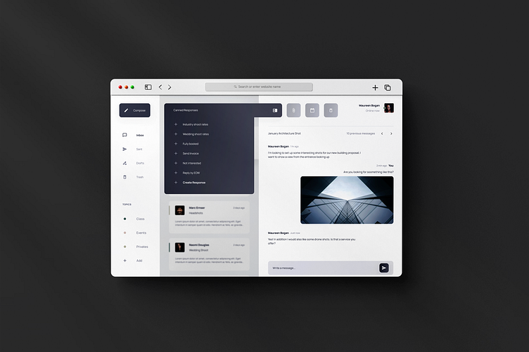
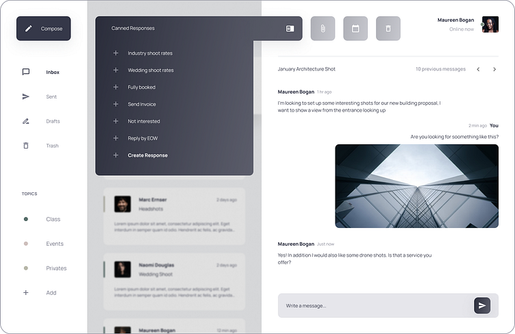
Canned Responses
Online entrepreneurs undertake the redundant task of sending the same email to new clients daily. In the prototype below, the user sends a detailed list of pricing options to a client in 5 seconds.
Users also have the option of creating more canned responses as the scope of their work changes and grows. Lastly, the canned response sits in the text entry field if a user needs to edit a reply before sending it.
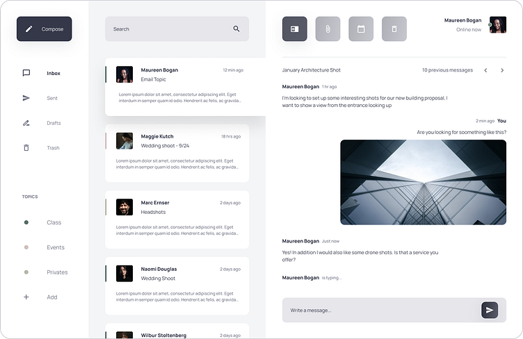
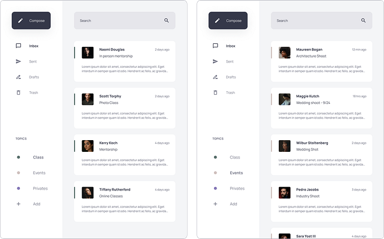
Feature 2 - Topical Organization
In the user persona provided for this case study, one of the tools that our users were familiar with was slack. I used a similar layout as the left-hand navigation bar in slack so that switching from topic to topic felt natural and familiar.
Efficiency through Simplicity
Platforms such as outlook and MS office are packed with features that make email feel like a daunting and formal experience. I chose to strip down the number of features provided on current platforms so that the user can solely focus on the point of email, to send a message.
Our user said email felt "too cluttered and clunky" I made it a point to create a modern, spacious UI that was easy to navigate.
Prototyping and Testing
Due to resources and time constraints, I could not do a round of user testing.
In a perfect world, I would facilitate AB testing with a group of users. The goal for both research groups would be to get the inbox to 0. Group A would have no topical organization and canned responses, while Group B would have both features. I would keep track of the time it took both groups to get to inbox 0
Hypothetically speaking, after comparing Group B's average time to Group A's, I would calculate how much faster Group B was able to complete the task.
Looking Forward
Integrating A Calendar
I would love to find a way to pair an email with calendar events, potentially using a google calendar API.
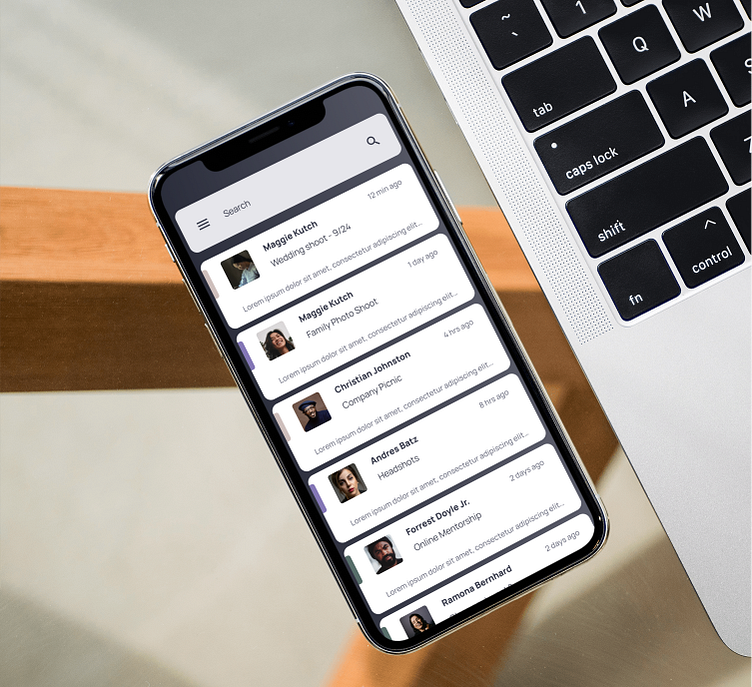
Mobile Platform
The current platform is limited to only a desktop. However, I think it would be necessary also to offer the service via a mobile app.
Building a product that is so integrated into our everyday lives was fascinating. If you've made it this far, thank you for your time!