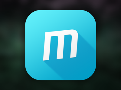
The Meeting App Icon
When in doubt, go trendy. An update to an app we did for a client is about to go live. No more skeuomorphism for this app, about time too.
So the old book based icon didn't really work any more. We went back and forth with a bunch of designs, but settled on a simple design with the logo for the Meeting book series, with the blue color of those books as well... and to spice things up, a trendy diagonal shadow.
I liked the old book icon, but I think this one is more effective.
More by Elías R. Ragnarsson View profile
Like
