Bringing a Hawaiian Bank Brand to Life 🌴
The Beginning
When I was hired on with Central Pacific Bank (CPB) as Head of Product Design, the marketing department within the bank had already kicked off a major rebranding effort with the agency Phenomenon about 6 months prior. The work was stunning, and it was ready to be integrated into a wide breadth of bank products with the intention of launching to the public in early January of 2021.
About the Bank
Central Pacific Bank was founded in 1954 by veterans of WWII who experienced first hand the social inequities of the time and had a vision for creating a bank that would serve all of Hawaii’s people.
Present day CPB serves as a major bank in Hawaii and as of June 30, 2022, operates 28 branches and 65 ATMs in the state of Hawaii. The bank is a leading force in supporting homeownership and small businesses in Hawaii as a market leader in residential mortgage and SBA loan originations.
CPB has never been a technology company, meaning most all of the platforms used come from third parties that allow varying levels of customization.
The Culture Challenge
Hawaiian people have a unique culture that is often misrepresented by tourism. They strongly value all things local, and life can be difficult for many because of sky high living costs. In business, there are many who are distrustful of mainland contributors. Because of joining in August 2020, I didn’t have an opportunity to travel to meet the island members of my team, and so building trust remotely and being empathetic to island culture was frequently top of mind.
The Brand
The brand agency’s work was a without a doubt, a masterpiece. Hallmarks of their work were bringing together CPB’s mid-century modern roots together with incredible, character-driven illustrations that embraced the local people, flora and fauna of Hawaii.
Product Design Challenge One: 🖥 Desktop Banking
FISERV’s Architect was the platform of choice for most retail (personal) and business banking. To bring the brand to Architect, a large illustration was used for the log in screen.
Basic things such as button styles, colors, and fonts were leveraged to customize UI elements. A custom module with icons and text links was added to make certain navigation items easily accessible. Designing for accessibility was also a core focus.
User Experience Improvements
While SASS software typically has many constraints, the CPB team was able to push for customizations. A large area of improvement was to re-organize the various ways to transfer money and pay bills. In many banking applications (including this one), each transfer type will navigate to its own page. Some examples include transferring to an external account via ACH, transferring to an external account via Zelle, transferring to someone else’s account within the same bank, transferring between a user’s own accounts, and paying a bill. All of these examples use the same baseline activity which is to move money from a user’s account to somewhere else.
A design was proposed to consolidate many of these transfer methods into one screen, but unfortunately, technical constraints didn’t allow for this solution to see reality.
Alternatively, all transfers were able to be nested under one main navigation item.
I identified that getting the account number was clunky because users would need to download a statement in order to access their account number. Account numbers are somewhat frequently used for things like setting up direct deposit or linking external bank accounts. To improve this, the account number was made more readily accessible on the account page. A show/hide icon were added for privacy and a copy icon was added to easily copy the number for times when it needed to be pasted.
Product Design Challenge Two: 📱 Mobile Banking
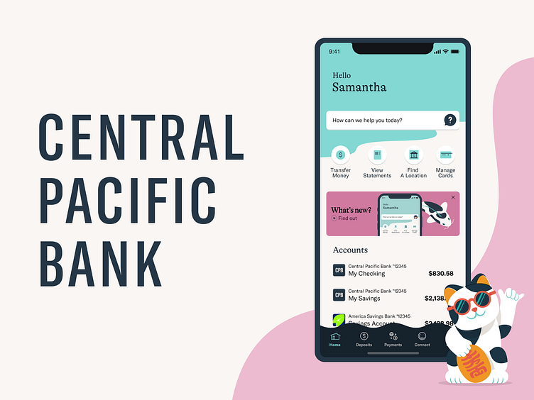
The CPB mobile app was built and implemented by MX, another SASS provider. For this project, several designers (myself included) worked on ideal-state designs that we then presented to MX. MX had a great designer who knew the ins and outs of how these platform customizations could be pushed in their product. The mobile app was able to leverage many custom illustrations at key points in the journey, and to the average eye, looked like a fully custom app.
The app store screenshots were a fun opportunity to push the creativity of the brand in product.
Product Design Challenge Three: 💬 Chat
Alongside bringing the brand to life, the product team had a goal to get live chat added to customer support. LivePerson was the partner selected.
The Persona
To lean in on CPB’s value proposition of friendly and personalized customer service, we needed to create an endearing persona for our chat service. I went through several iterations with the customer support team to create an image that Hawaiians would identify with. It was important that her hair was down and the flower correctly represented the plumeria.
The name “Nalu,” which means “wave” in Hawaiian, was chosen by the team.
Chat Dialog
The customer service team needed guidance on how to set up the basic chatbot dialog. I used Miro in several working sessions to build out the first draft of dialog questions and responses. In prior research, users had expressed that chatbots were especially valuable if there was fast access to an agent, so we made this option very accessible.
Conclusion 🌺
Suffice to say that many more projects and challenges took place during my time with Central Pacific Bank, all of which were a great learning experience. I had a lot of exposure to the intricacies of finance and banking, and that really inspired me to see banking in a different light. I am mostly impressed with the amount of creative ways myself and the team were able to push on exterior vendors to be more creative with their own product problem solving as we worked to bring Hawaiian life and culture into their platforms.


